Laden...

Laden...
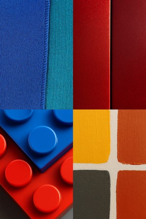
Material has a direct and often underestimated influence on how color appears. Structure, porosity, gloss, and moisture content largely determine whether a color visually matches a reference. Especially with natural products – such as concrete, wood, brick, or natural stone – color differences can never be completely excluded. This is why color assessment for materials requires specialist knowledge, precise measurement methods, and a good understanding of tolerances.
For a municipality, we investigated which color tolerances should be used for the restoration of concrete slabs on an event square. Concrete contains natural variations, microstructures, and 'pits' that affect light reflection. This makes an exact color match unrealistic; it is about a bandwidth that is aesthetically and technically acceptable.
The objective in this project: the smallest possible visual color difference, fitting the character of fair-faced concrete.
To determine a tolerance bandwidth, a standard color was first defined:
This median value formed the basis for all further color comparisons.
Test samples were stored conditioned and measured, so that:
This made a reliable comparison between test samples and existing slabs possible.
Color measurements were performed with a spectrophotometer 45/0 according to ISO 11664 (CIELAB, D65, 10°). This measurement geometry is essential for materials with texture or structure, because:
Because fair-faced concrete is almost achromatic, the focus in this project was primarily on the L values (lightness). The a and b components had insufficient relevance for the end result.
In the concrete industry, the statistical principle applies:
For this project, the values of the CUR 100 gray scale applied:
This method aligns with internationally common quality standards in the concrete and construction sector.
The restored concrete slabs met a tolerance of ±1 scale unit, which is considerably stricter than the permitted ±2 according to CUR 100. This achieved:
The final assessment was performed both instrumentally (CIELAB) and visually. For the visual analysis, photos were normalized based on a neutral gray card, so that lightness differences could be objectively assessed.
This case shows that color assessment is not just about formulas or ΔE values. For natural materials, factors like these play a crucial role:
Therefore, color assessment at the material level requires knowledge of both visual assessment, instrumental analysis, and material science.
In our courses, you will learn:
👉 View the courses of the Dutch Color School: https://kleurenschool.nl
Questions about material influences, color tolerances, or visual assessment? Contact the specialists at the Netherlands Color Institute: https://snki.nl/en/contact
How large can a color difference be before a product is rejected? Why tolerances depend on the product, material, and market — and how to establish them.
Spectrophotometer validation according to ISO 17025 and ISO 7724: requirements, process, reference standards, and common deviations. Everything about ensuring reliable color measurements.
The measurement environment is just as important as the instrument itself. Temperature, light, vibrations, and contamination directly affect measurement results. Learn how to control environmental factors for reliable color measurements.