Laden...

Laden...
In our previous blog, we described the influence of color on urban space and the exterior of buildings. Rhythm, order, contrast, and spatial effect play an important role there. These principles also apply to interiors, but inside a building, several specific aspects come into play. Below, the most important insights are explained.
For private clients, personal preference is central: the design must align with the wishes, experience, and lifestyle of the user. In public and semi-public buildings (such as schools, healthcare institutions, hospitals, theaters, or municipal buildings), this works differently. There, it concerns a large diversity of users, which means objective requirements, accessibility, clarity, and psychological effects of color carry more weight.
The color choice must therefore fit the purpose of the space and the type of visitor.
The influence of color increases as people stay longer in a space.
Short duration of stay (entrances, corridors, stairwells): Here, bold, even provocative colors can function well. They attract attention, direct movement, or give identity without creating long-term strain.
Long duration of stay (living rooms, classrooms, waiting areas, offices): In such spaces, color works better when it plays a supporting, service role. Colors that are too dominant can cause restlessness or fatigue; calm color balance promotes comfort and concentration.
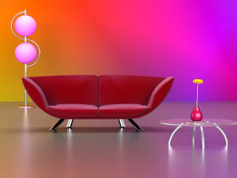
Color influences the perception of shape and size:
By applying two different colors on the long walls, you can also break the effect of a "tunnel."
In public buildings, safety colors play an important role. The standard NEN 3011:2015 provides guidelines for:
Examples:
Correct color use directly contributes to safety, recognition, and orientation.
Color use in interiors is more than aesthetics. It influences:
The proper use of color supports the function of a space and the well-being of users. For professionals in architecture, design, and interior, knowledge of color effect is therefore indispensable.
In the courses of the Dutch Color School, you will learn:
👉 View the courses at: https://kleurenschool.nl
Questions about color application in architecture or interior? Contact the specialists at the Netherlands Color Institute: https://snki.nl/en/contact
From gray apartment blocks to neutral interiors – the Netherlands suffers from double chromophobia. Scientific research shows: colorless environments harm well-being, creativity, and social dynamics. Hospitals use color to heal, but where do healthy people live?
Color increases brand recognition up to 80% and determines 90% of first product assessments. Discover how color identity shapes brand personality, which industry-specific color conventions exist, and how to ensure color consistency.
Color preferences are influenced by historical, cultural, psychological, and individual factors. Discover the main principles of color preferences and how they are strategically applied in design and marketing.