Laden...

Laden...
We see it everywhere in the Netherlands: white walls, beige sofas, gray cushions. It is presented as timeless design. Gray also dominates in public spaces: north-facing gallery flats, concrete facades, and stony squares.
These choices seem neutral and safe, but scientific research shows they have a significant impact on well-being, health, and social dynamics. In both architecture and interior design, we still see what researchers call chromophobia: a persistent reluctance or fear to consciously use color.
The Netherlands has a unique situation where both public and private spaces create color-poor environments. Outdoors, many live in gray, north-facing housing complexes. Indoors, neutral tones like white, beige, and gray dominate. This leads to a double effect: residents are surrounded day and night by colorless spaces that provide insufficient visual and psychological stimulation.
Dr. Roger Ulrich's groundbreaking research from 1984, published in the prestigious journal Science, showed that hospital patients with a view of nature recovered significantly faster than patients who only saw a wall¹. This study laid the foundation for decades of research into the impact of the physical environment on well-being.
A systematic review of more than 3000 studies on color in healthcare environments concludes that "color is a fundamental element of environmental design, connected to psychological, physiological, and social responses of people"². Dr. Rikard Küller's peer-reviewed research "Color, Arousal, and Performance" shows measurable effects: color environments directly influence arousal, attention, and cognitive performance³.
The AIC (International Colour Association) Conference reports an alarming trend: "Today, variations of gray and beige are widely used instead of the saturated colors that were used until recently"⁴. This systematic shift toward colorlessness has far-reaching consequences that many architects and interior designers underestimate.
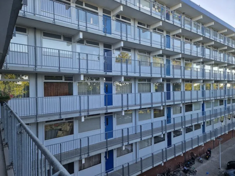
A striking example can be found in Krommenie: an apartment building by housing corporation Parteon, with a facade entirely oriented to the north and dominated by gray panels in a cool, bluish-gray color scheme, with doors in a similar muted blue tone. The rooms themselves are largely south-facing and receive sufficient light. But this is not about the interior spaces, but about the experience of the building as a whole, and specifically the north facade where residents arrive, meet each other, and where social interaction takes place.
It is precisely this north facade that looks somber and unattractive due to the cool gray and blue-gray colors, the lack of variation, and the repetitive, monotonous layout. This type of facade lacks any form of warmth, identity, or invitation. Residents also report that livability in the flat is under pressure: there are problems with loitering youth, arson, pollution, and a lack of community. In the Gagarinstraat, where a residents' group has now become active, this is regularly discussed and advocacy is made for action.
This situation illustrates what AIC research on collective housing shows: "Architects tend to use very neutral, even monotonous colors and materials in common areas"⁵. The result is what researchers call "environmental depression" - a subtle but chronic mood decline caused by colorless environments.
The choice for cool gray facades on a north facade is not a small oversight — it goes against the most basic principles of color application and environmental psychology. Every education program in construction, architecture, and interior design teaches this in the first year:
Do not place cold colors on north facades, because they amplify the coolness and gloom that is naturally caused by northern light.
Northern light is diffuse, poor in warmth, and amplifies bluish tones. Cool colors like gray and blue make a north facade even darker and colder. Warm tones such as sand, ochre, terracotta, or soft yellow can actually enhance the light experience and psychological warmth.
Dutch color expert Clara Froger writes in her article "Color in New Construction" about this issue: "Housing associations treat the color of the streetscape more as a block, more uniform"⁶. But in her work in Zoetermeer's Seghwaert district, she showed that color can function as "an essential part of urban planning plans," with noticeable positive effects on neighborhood identity and resident satisfaction.
Yet housing corporation after housing corporation, often on the advice of architects, chooses cool gray facades on the north side. And with that, they make a mistake that goes beyond aesthetics — it directly affects the experience, well-being, and social dynamics in the neighborhood.
Many architects know this, but consider aesthetics and uniformity more important than experience. Gray is "safe," low-maintenance, and according to some modernist movements "timeless." AIC research shows that "neutral color weakens attention and distracts from imperfections and design flaws"⁷. And because clients do not push for knowledge of color psychology, the architect delivers what is requested.
Dutch architectural historian Fabian De Vriendt writes in his master's thesis "Color in Architecture": "Color brings emotion to architecture, where form is more rational"⁸. He points to the misconception that architecture must be white or gray for "timelessness" - a myth that comes at the expense of human well-being.
Actually more importantly: the housing corporation is responsible for the experience and livability of its properties and its residents. And they should know better. It is their task to manage not only costs and maintenance, but also the social and psychological quality of the living environment. This requires knowledge of basics such as color psychology and orientation.
Research on "defensible space" shows that gray complexes experience more vandalism and crime because residents do not identify with colorless environments⁹. Ownership and neighborhood pride disappear when the physical environment does not stimulate emotional connection.
Remarkably, it is precisely the sector with the heaviest responsibility for health that now leads in color use: healthcare. Modern hospitals show how color can be purposefully used to promote recovery and well-being.
Dutch hospitals consciously invest in so-called healing environments, with colorful art, natural tones, and therapeutic colors. The RIVM reports: "Cheerful, warm colors make for a more pleasant stay, from waiting room to operating room"¹⁰.
Anne Hagerup's research on mental health facilities concludes: "Supportive designs promote well-being and are designed to support coping with stress"¹¹. Dutch mental healthcare increasingly applies these evidence-based principles, with measurable results: faster recovery, less medication, and higher satisfaction scores.
The irony is evident: hospitals — where people come to get better — are more colorful than the neighborhoods where healthy people live to be happy.
In many cases, architects and designers choose gray and neutral tones because they are supposed to be "low-maintenance" or "timeless." Interior brands promote neutral because it is commercially safe: neutral products have significantly fewer returns¹².
AIC research shows that "for some destinations (offices, commercial, public buildings) gray and white have largely become favorites, perhaps because they do not create psychological stress in the population"¹³. But what may be functional for temporary workplaces becomes problematic when applied to living environments where people spend their entire lives.
Interior designer Emma Richardson, who worked for major furniture brands for fifteen years, confesses: "We test every color on focus groups. Bright colors polarize - people have strong opinions. Neutral colors always get 'acceptable' as a score. Never 'great,' but also never 'terrible.'" This "acceptable" score is worth its weight in gold commercially: fewer returns, fewer complaints, less risk, maximum profit.
But what is good for retail revenue is bad for human well-being. People buy beige because it feels "safe," but at home they realize it is also depressingly boring. Too much trouble to return for something that is "acceptable."
"Timeless design" is marketing jargon for "boring but safe to sell." Social media exponentially amplifies this trend. Influencers show perfectly styled beige interiors with thousands of likes. "Timeless and elegant," they write.
"Natural colors" is another marketing term. Sand, stone, wood - sounds organic and healthy. But actually go into nature. Do you only see beige? Of course not. Real nature is an explosion of color: green forests, blue skies, red flowers, yellow suns. Real natural colors are vibrant, stimulating, energetic - the opposite of the boring "natural" colors in furniture stores.
Children in colorless environments develop measurably less creativity. Leonne Campfens' Dutch research shows that students who are sensitive to their environment perform significantly better in colorful spaces than in white, sterile environments¹⁴.
The double impact - gray neighborhoods combined with neutral interiors - creates a perfect storm of visual deprivation. Children growing up in both gray flats and beige children's rooms experience chronic understimulation of their visual and emotional development. Fantasy withers, creativity stagnates, social skills decline.
Dr. Kyung Hee Kim's research shows that children need constant color stimulation for optimal brain development¹⁵. Neutral environments - both at home and in the neighborhood - significantly inhibit this development.
Health economists calculate that gray north complexes with neutral interiors generate significantly higher societal costs¹⁶:
Color interventions, on the other hand, have a demonstrable return on investment. Every euro invested in thoughtful color use saves multiple euros in societal costs.
While the Netherlands holds on to gray uniformity, neighboring countries are ahead:
The contrast is painful: the Netherlands exports its gray architecture worldwide while other countries avoid the Dutch mistake and invest in evidence-based color use.
Dutch color expertise does indeed exist. The Dutch Color School teaches: "A carefully developed color plan influences size and proportions and contributes to a sense of identity and well-being"¹⁷.
But this expertise is ignored by architects who choose "safe" uniformity and housing corporations that only manage costs and maintenance.
As a color professional, you can make a difference. Educate architects about evidence-based color use. Show housing corporations the business case: colorful neighborhoods are healthier, safer, and economically stronger neighborhoods. Inform consumers about the psychological impact of their interior choices.
The next generation is growing up in double colorlessness: gray neighborhoods and neutral interiors. Their creativity is systematically suppressed, their personality neutralized, their well-being harmed.
This can change. Dutch hospitals prove we have color expertise and can apply it successfully. Our social housing and interior industry must follow this example.
Dutch hospitals use color to make people better. Dutch housing corporations use gray to save costs. Dutch interior brands promote beige to avoid risks.
The priorities are reversed. Residents deserve colorful living - both outdoors and indoors. The science is clear, the expertise is available, international examples exist.
Gray is not a neutral choice. It is a choice against life, against well-being, against humanity. The Netherlands has the knowledge and skill - time to use it where it is most needed.
👉 Want to learn more about color psychology and evidence-based color use? View the courses at kleurenschool.nl
Questions about chromophobia and color in architecture? Contact us via info@kleurinstituut.nl or call +31 (0)70 364 98 02.
¹ Ulrich, R.S. (1984). View through a window may influence recovery from surgery. Science, 224(4647), 420-421.
² Tofle, R.B., Schwarz, B., Yoon, S.Y., & Max-Royale, A. (2003). Color In Healthcare Environments. Coalition for Health Environments Research, p. 7-8.
³ Küller, R., Mikellides, B., & Janssens, J. (2009). Color, Arousal, and Performance — A Comparison of Three Experiments. Color Research & Application, 34(2), 141–152.
⁴ AIC Proceedings (2023). Proceedings of the 15th Congress of the International Colour Association, p. 174.
⁵ AIC Proceedings (2021). Proceedings of the International Colour Association Conference, p. 365.
⁶ Froger, C. Color in new construction. Article on color in urban planning.
⁷ Weber's research cited in AIC Proceedings (2023), p. 174.
⁸ De Vriendt, F. (2021). Color in Architecture. Master's thesis, Ghent University, p. 23.
⁹ Newman, O. (1972). Defensible Space: Crime Prevention Through Urban Design. Macmillan.
¹⁰ RIVM (2021). Health-promoting care environment. Green Deal Sustainable Care.
¹¹ Hagerup, A., Wijk, H., Lindahl, G., & Olausson, S. (2024). Toward a Future Orientation: A Supportive Mental Health Facility Environment. Research paper.
¹² Internal market research cited in industry reports (2019).
¹³ AIC Proceedings (2011). Interaction of Colour & Light in the Arts and Sciences, p. 680.
¹⁴ Campfens, L. The role of color use in lecture halls in relation to environmental sensitivity. Thesis.
¹⁵ Kim, K.H. (2011). The creativity crisis: Environmental factors in childhood development. Creativity Research Journal, 23(4), 285-295.
¹⁶ Samet, J.M. et al. (2007). Indoor environments and health. Environmental Health Perspectives, 115(6), 958-964.
¹⁷ Dutch Color School (2009). Working Effectively with Color, p. 6-7.
Apple green is a beautiful color in nature. But on a house? Why color association determines whether we accept a color on a building — and what that says about color policy.
All colors can be combined, but not every combination is functional or pleasant. Why color harmony is not a matter of taste, but of physiology and craftsmanship.
Color increases brand recognition up to 80% and determines 90% of first product assessments. Discover how color identity shapes brand personality, which industry-specific color conventions exist, and how to ensure color consistency.