Laden...

Laden...
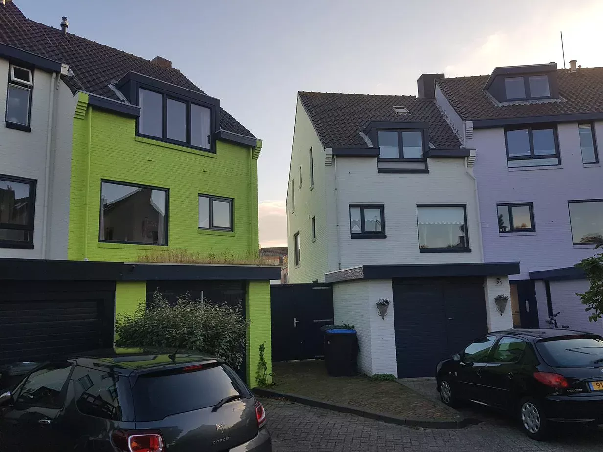
Apple green is a beautiful color. When we walk in nature, we see a spectrum of colors and nuances of apple green. It's a gorgeous color.
What makes it then that the neighbor can't appreciate the green house?
This has to do with our association. We have been building houses for ages with earth-colored materials — wood, stone, masonry. Green is the color of nature. We don't associate it with a sturdy house.
That's why we as people often don't find green architecture beautiful. Not because the color itself is ugly, but because the color doesn't fit our experience of what a house should be. The color is not harmonious with the object.
A color never stands alone. The context determines whether we experience a color as fitting.
During my conversation with Ineke, I indicated that the color is too intense — far too saturated. I can understand that there are people who have trouble with it. There are plenty of colors that are pastel and colorful, which Ineke would also like.
But the remarkable thing in this story is not the green house. It's the argumentation and the inconsistency of the enforcement.
Ineke's green house is certainly not a pastel color. But neither are the dark gray houses in the same street. Nor the white houses. And the red and orange house further down even less so.
If the municipality sets pastel colors as the norm, then that norm should be consistently enforced — not selectively for the house that stands out the most.
Does this case have to do with lack of knowledge about color and color image in architecture? I think so. Too often color policy is drawn up without clear definitions and without measurable criteria. The result: arbitrariness in enforcement and conflicts that end up in court.
Municipalities that implement color policy benefit from:
We are happy to help municipalities develop a well-founded color plan — based on color science, not on feeling.
Mark Kotterink — color expert, Nederlands Kleur Instituut
From gray apartment blocks to neutral interiors – the Netherlands suffers from double chromophobia. Scientific research shows: colorless environments harm well-being, creativity, and social dynamics. Hospitals use color to heal, but where do healthy people live?
Color influences how we perceive buildings — from apparent size to spatial rhythm. How does this work and what principles underlie it?
NCS has added 100 new standard colors in the low saturation area. This article explains what these colors mean for professionals in architecture, interior and product design.