Laden...

Laden...
When we speak of architecture, we are talking about the exterior or the interior of a building. The influence of color in architecture is significant in both cases. This article focuses on the exterior. In this context, color has various possibilities to influence the urban outdoor space.
Because some colors appear to come toward us and others recede from us, a colored mass can appear larger or smaller than would be the case with a neutral color. This effect depends not only on the hue. Lightness also plays a role.
A light-colored building against a dark background appears larger than the same building in a dark color. However, a dark building against a light background also appears larger than a light building against the same light background.
In short:
This principle is directly applicable when designing facades, building volumes, and urban planning ensembles.
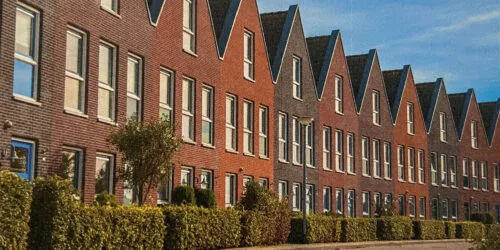
A consequence of this color effect is that the space between different facades appears larger or smaller. By having colors blend together or not, you can bring an outdoor space together as a whole or let it fall apart into individual building elements.
By means of accents in a specific pattern or through color variations, rhythm can also be introduced — even when the building volume itself does not possess that rhythm.
We can make a building blend into its surroundings, harmonize, or create a contrast. The greater the contrasts, the more isolated the different parts stand in relation to each other.
Interestingly, special, coordinated, contrasting colors can actually lead to a harmonizing whole. Contrast and harmony do not exclude each other — provided the color choice is deliberate.
By giving different building elements the same color, they visually belong together. The opposite also applies: by giving parts different colors, we indicate that they are separated.
This allows building volume to be divided into smaller elements, creating a more human scale. This is a frequently used principle in large-scale housing and utilitarian projects.
Different colors can refer to functions that need to be visible — entrances, stairwells, floors, wings. This allows users to intuitively orient themselves without signage.
This principle is applied in hospitals, educational buildings, parking garages, and public buildings where wayfinding is essential.
The principles described above form the basis of professional color application in the built environment. They touch on color perception, color contrast, and the relationship between color and spatial experience.
In a follow-up article, we zoom in on the interior — where color not only influences spatial experience but also the well-being, concentration, and behavior of users.
Related services:
From gray apartment blocks to neutral interiors – the Netherlands suffers from double chromophobia. Scientific research shows: colorless environments harm well-being, creativity, and social dynamics. Hospitals use color to heal, but where do healthy people live?
Apple green is a beautiful color in nature. But on a house? Why color association determines whether we accept a color on a building — and what that says about color policy.
Color perception is context-dependent. Identical color samples can appear different due to background color, light, or spatial configuration. Simultaneous contrast amplifies differences - a gray on red appears greener. Discover how context influences color assessment.