Laden...

Laden...
Color perception is strongly influenced by the context in which a color is observed. The interaction between light, object, and observer determines how a color is subjectively experienced. Identical color samples can create a different impression under different background colors, lighting conditions, or spatial configurations. This makes context a critical factor in color assessment and color consistency.
Simultaneous contrast describes the phenomenon where a color appears different depending on the surrounding color areas. This applies to both lightness and hue:
This effect occurs because the visual system amplifies differences instead of registering absolute values. The underlying neurophysiology enhances edge contrasts to better distinguish objects from their surroundings.
The extent and intensity of contextual effects are influenced by properties of the scene. Research shows that simultaneous contrast becomes stronger when:
Saturated colors are generally less sensitive to these contextual shifts than unsaturated colors. Therefore, ISO 3664 prescribes the use of neutral gray values in visual assessment environments.
Contextual effects are relevant in various design and production environments.
Simultaneous contrast can be used to optically emphasize elements without physical modification of color values.
In composite products with different materials (e.g., dashboard + upholstery), visual inconsistency can occur despite correct spectral measurement. This emphasizes the need for context-aware assessment.
Predicting color perception requires models that incorporate environmental variables. The CIECAM02 model describes perceptual attributes such as brightness, saturation, and hue under different viewing conditions.
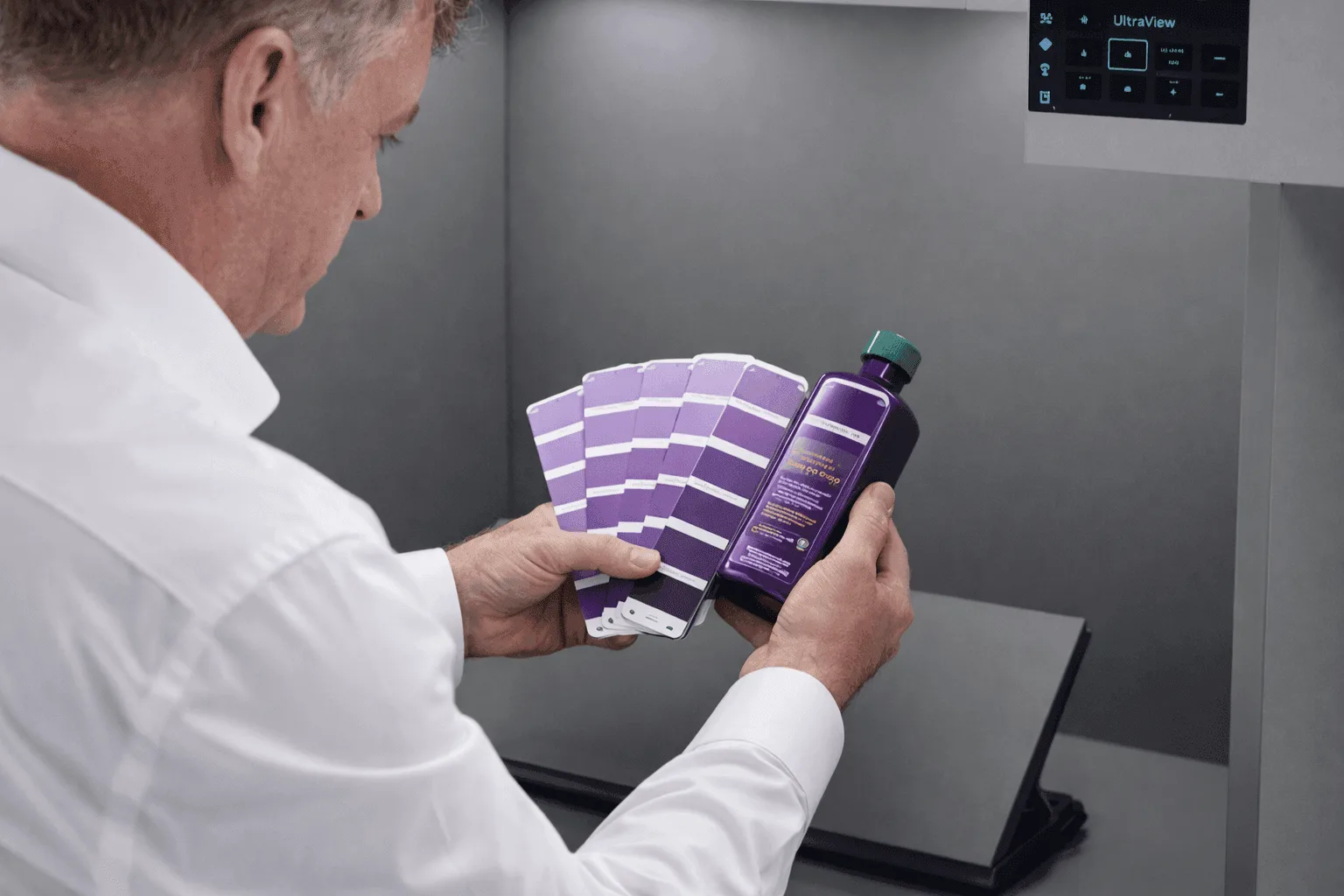
For visual assessments, standards such as ASTM D1729 specify:
These conditions reduce subjective variation in assessment.
Professional workflows can reduce contextual distortions by:
Situation: Instrument panel and center console have identical L*a*b* values but appear visually different.
Analysis:
Solution:
Result: Visual consistency improved without spectral modification of center console
Color perception is context-dependent and is influenced by surrounding color, lighting conditions, and spatial structure. In professional color applications, insight into these effects is necessary for consistent color assessment and accurate communication. Standardization of assessment, context-aware design choices, and training of assessors form the basis for reliable color perception in various fields of work.
👉 Want to learn more about color perception and visual assessment? View the courses at kleurenschool.nl
Questions about contextual color perception? Contact us via info@kleurinstituut.nl or call +31 (0)70 364 98 02.
Each material has unique light interactions that require specific measurement methods. Plastics, metals, and textiles each introduce their own challenges for color assessment. Discover material-specific solutions and protocols.
Color influences how we perceive buildings — from apparent size to spatial rhythm. How does this work and what principles underlie it?
The human eye can distinguish millions of color nuances, but is not reliable enough for color-critical assessments without tools. Learn which factors influence visual color perception.