Laden...

Laden...
Lightness is a fundamental color parameter that describes the brightness or darkness of a color. It determines to what extent white or black has been added to a color and directly influences how a color is experienced. In this article, the functional and design-technical aspects of lightness are explained.
Lightness (L*) is a dimension within the CIELAB and RAL Design Plus system, among others. It indicates the relative brightness of a color on a scale from black (0) to white (100).
In visual systems such as NCS, lightness is not used, but rather blackness. As a result, the natural lightness of hues is not considered. This can have consequences for design choices where lightness is functionally decisive.
Lightness influences multiple perceptual and functional properties in design environments.
Lightness is essential for creating:
A controlled lightness contrast ensures that elements are more recognizable and functionally usable.
In architecture and interior, lightness plays a direct role in how a space is experienced.
Effects of lightness:
Manipulating lightness is therefore an instrument for steering the atmosphere and functionality of a space.
In printed materials, signage, and digital interfaces, lightness largely determines readability.
Important technical points:
Lightness contributes to the experience of a design. Common associations:
Light colors
Dark colors
By consciously applying lightness, the desired emotional response can be reinforced.
Lightness contrast is one of the most determining factors for:
In interior design, for example, lightness contrast determines how floors, walls, and doors relate to each other and how users navigate the space.
Lightness is a powerful and technically relevant instrument within color design. By systematically applying lightness and lightness contrast, design choices emerge that are both aesthetically and functionally better substantiated. It is therefore an indispensable component of professional color consulting and color engineering.
👉 Learn more about applied color knowledge and professional design with color at the Dutch Color School: kleurenschool.nl
Questions about lightness or color design? Contact us at info@kleurinstituut.nl or call +31 (0)70 364 98 02.
All colors can be combined, but not every combination is functional or pleasant. Why color harmony is not a matter of taste, but of physiology and craftsmanship.
Color deviations arise from variation in material, process, measurement, or specification. 42% is directly linked to process variation. Discover the technical framework for systematic diagnosis with five core steps and RCA methods.
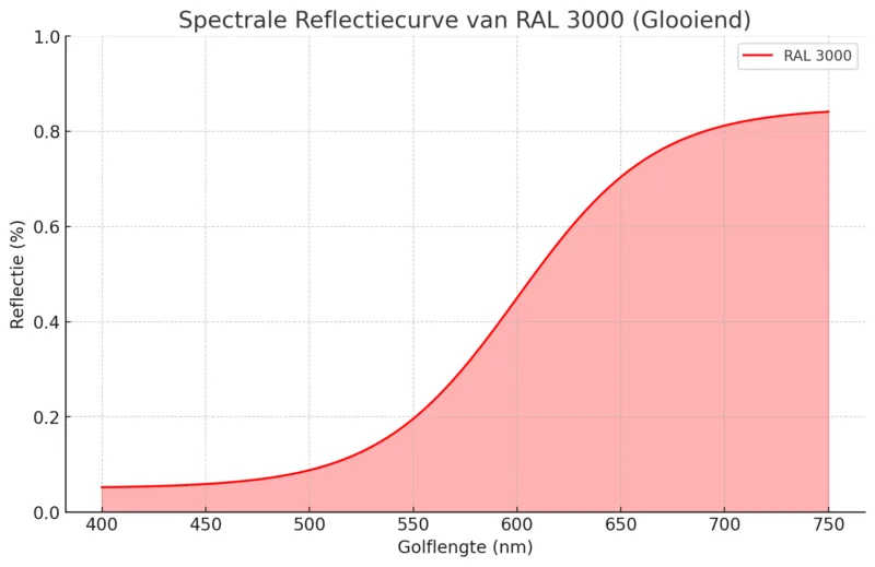
LRV, lightness L*, and spectral values each describe in a different way how a color reflects light. Learn the technical differences between energy reflection, perceptual brightness, and spectral curves using RAL 3000 as an example.