Laden...

Laden...
In previous blogs we emphasized the importance of visual color assessment as a profession. In this, not only perception plays a role, but also language. Those who work professionally with color must master the language of color — not the commercial color names, but the systematic concepts that objectively describe color. In this final part of the blog series on visual color assessment, we delve deeper into that necessary color language.
Marketing names like Sunset Coral, Deep Forest or Urban Stone sound attractive, but don't help a color assessor further. Professional color communication revolves around three fundamental characteristics:
These three dimensions appear in every professional color ordering system, including Munsell, NCS and RAL Design.
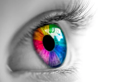
Hue tells you which color you see: red, yellow, blue, green or a mixture. But: hues lie on a continuum. What for one person is "red" may for another be rather "red with a touch of blue."
Therefore, coding is essential.
Lightness (value) indicates to what extent a color reflects light.
This explains why equally saturated colors still show different brightness. In color circles, lightness becomes visible in the gray tone distribution around the chromatic colors.
Saturation (chromaticity) tells how much pure color pigment is present in the color image.
This is crucial when assessing color quality, mismatch or nuance differences.
NCS describes color through perception and uses three scales:
Elementary colors within NCS are white, black, yellow, red, blue and green. An example: S 4030-R90B
RAL Design also works three-dimensionally:
Example: RAL 120 40 20
RAL uses no names but numerical codings, making color exactly reproducible.
Professionals must be able to identify color exactly. For example:
"I find S 4030-R90B too blue; I want it more red."
Then a color assessor knows:
This is objective communication. No interpretation, no noise — only clear craftsmanship.
Those who master the language of color can make decisions faster, assess more precisely and collaborate better in design, production, QC and architecture.
Do you want to master the language of color and learn to assess, choose and communicate professionally? Our trainings help you bring your profession as a color assessor or color consultant to the highest level.
👉 View the trainings at kleurenschool.nl: https://kleurenschool.nl
Questions about color notation, NCS, RAL Design or professional color communication? Contact the specialists at Stichting Nederlands Kleurinstituut: https://snki.nl/en/contact
The municipality of Den Helder demands that a bright green house be repainted: the color is allegedly not a pastel color. But what are pastel colors exactly? An analysis using the NCS system.
The NCS color image consists of black + white + saturation = 100%. Therefore, the sum of blackness and saturation can never be 100 or more. Here's the explanation.
NCS colors that start with 00 are first edition notations from 1979 — discontinued since 1995. Why they still appear, what the difference is and what to look out for.