Laden...

Laden...
In recent weeks, it was everywhere to be seen: the newspapers wrote about it, it was on Hart van Nederland, in YouTube videos, on LinkedIn. The green house of Ineke in Den Helder. The municipality demands that Ineke repaint her house because the color is not appropriate within the streetscape. It has now come to the point where the judge will rule within two weeks.
Reason for me to visit the neighborhood — and Ineke.
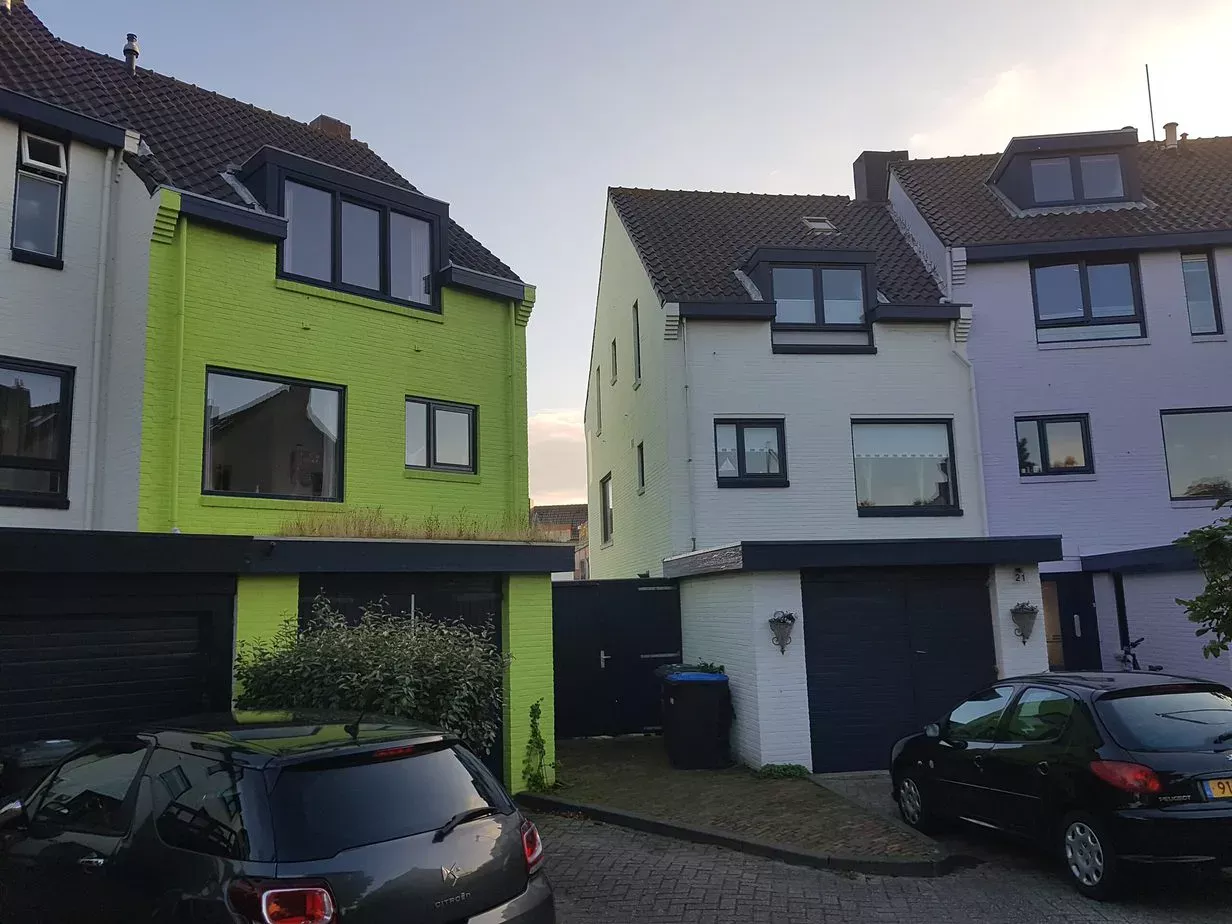
When you drive to the street Pluto, you can't miss it. The green house stands by the water, on the left side. Does it stand out? The green house stands out.
As you drive further through the streets toward the green house, you see a range of achromatic and chromatic houses. All painted. But what's going on? I had already read a bit in the newspaper, but hearing from the source is best. So I rang the doorbell at the green house, introduced myself, and Ineke invited me to come inside.
"I love color, isn't this fantastic? I don't understand the problem! This color has been on here for a long time and only now they come with this. One neighbor thinks it's a beautiful color, the other complains," says Ineke, dressed in pink pants and a magenta sweater.
"But it is quite a bold color," I said cautiously. "But how does it work?"
Ineke tells her story in detail. She loves color — it can't be crazy enough for her. She loves green and had asked the painter to paint the house apple green. The new neighbor, who came to live there later, cannot appreciate it. The house reflects on the white wall of the neighbor. Reason to first complain to the neighbor and later to the municipality.
The municipality also finds the color too bold. Some years ago, the municipality had adjusted the color policy and determined that pastel colors must be applied in this neighborhood. Ineke's house already had a green color at that time.
The question is: is apple green a pastel color?
Whether the municipality can just demand that you adjust the color of your house is a legal question — I'll leave that to the judge. Questions I do find interesting:
When you drive through the neighborhood, it seems that the municipality itself is not very clear about this. Besides Ineke's green house, there are many more houses that do not have a pastel color. Most houses in the street are too white, too black, or too saturated to be classified as a pastel color.
On Wikipedia we read: "A pastel color is a soft color obtained by mixing a pure pigment with a light color, usually white or light yellow."
But where is the boundary? When is it no longer pastel?
In my opinion, there are three boundaries:
In a pastel color, the white content in the color image must dominate, but color must be visibly present. This means that the white proportion must in any case be greater than 50%.
In the NCS system, the color image is:
Black + White + Saturation = 100%
NCS indicates the black proportion and saturation proportion in the notation. The white proportion is the derivative.
The boundary series where the white proportion is exactly 50%:
| NCS nuance | Black | Saturation | White | Pastel? | | ---------- | ----- | ---------- | ----- | ----------- | | S 1040 | 10 | 40 | 50 | Boundary ✅ | | S 2030 | 20 | 30 | 50 | Boundary ✅ | | S 3020 | 30 | 20 | 50 | Boundary ✅ | | S 4010 | 40 | 10 | 50 | Boundary ✅ | | S 4505 | 45 | 05 | 50 | Boundary ✅ |
Everything with more than 50% white falls within the pastel range. Everything with less than 50% white falls outside.
If we add even more white, the color virtually disappears. Then we no longer speak of pastel colors but of off-whites. These are colors with a maximum of 5% saturation and a maximum of 45% black.
This creates a clearly defined area in the NCS color triangle:
| Zone | Characteristic | | -------------- | --------------------------------------------------------- | | Off-white | Saturation ≤ 5%, very high white proportion | | Pastel | White proportion > 50%, color visibly present | | Outside pastel | White proportion ≤ 50% — too saturated, too dark, or both |
The majority of houses on Pluto in Den Helder are either off-whites, or have too much black, or are too saturated to be classified as a pastel color.
This means that the municipality either has not clearly defined what pastel colors are, or applies arbitrariness in enforcement. In any case, the policy is not consistent.
Ineke's green house stands out — that's correct. But if you set pastel colors as a standard, you must also define that standard. And enforce it consistently.
Mark Kotterink — color expert, Netherlands Color Institute
The NCS color image consists of black + white + saturation = 100%. Therefore, the sum of blackness and saturation can never be 100 or more. Here's the explanation.
NCS colors that start with 00 are first edition notations from 1979 — discontinued since 1995. Why they still appear, what the difference is and what to look out for.
Working professionally with color requires more than a good feeling. Discover what knowledge and skills are needed to work systematically and substantiated with color as a color expert in interior, architecture and industry.