Laden...

Laden...
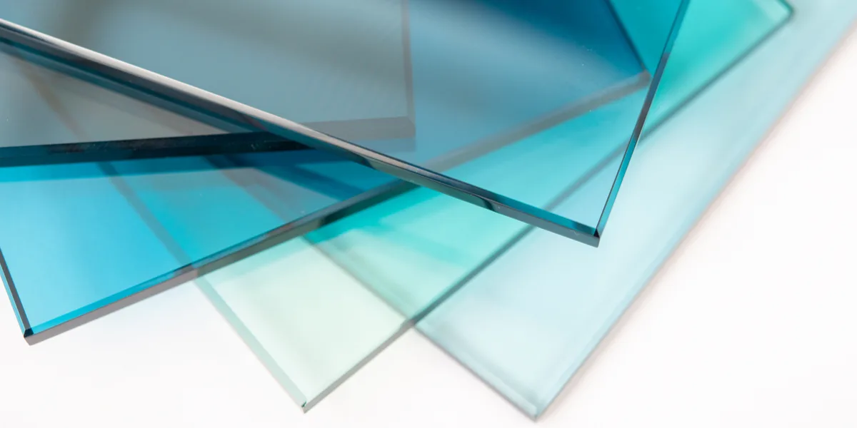
In professional color communication, precision is essential. Yet the same word keeps appearing in conversations with designers, painters and manufacturers: tint. Although common in everyday language, it's a term better avoided in technical contexts. The main reason: tint has multiple meanings, making misunderstandings likely.
In practice, tint roughly refers to two different concepts:
Because the word can refer to both, confusion regularly arises. Professional color assessment requires that you name exactly what should change about a color — and tint makes that impossible.
When a client says: "Can it be a tint lighter?", it's not clear whether they mean:
The term is therefore too diffuse for technical color work.
Unambiguous terms are needed for professional communication.
Hue indicates the direction in the color spectrum: red, yellow, green, blue and all mixtures in between. It determines which color we see.
Saturation indicates how much pure hue is present in the color image.
Together with lightness, these parameters form the basis of every technical color description.
The word tint sometimes seems handy, but obscures important technical choices.
When in a restaurant a customer says the food "doesn't taste good", that could mean:
The chef can't do anything with that.
The same applies to color:
This question can technically mean:
Three completely different color-technical interventions — the same vague phrasing.
For colormakers, designers, architects and quality controllers, it is therefore crucial to name exactly which parameter should change.
Clear color communication prevents:
Those who work professionally with color should speak in terms such as:
Not in terms like tint.
Do you want to refine your color language and work with an unambiguous system like NCS? In the trainings of the Dutch Color School you will learn:
👉 View the trainings at: https://kleurenschool.nl
Questions about professional color communication or color notation? Contact the specialists at Stichting Nederlands Kleurinstituut: https://snki.nl/en/contact
The municipality of Den Helder demands that a bright green house be repainted: the color is allegedly not a pastel color. But what are pastel colors exactly? An analysis using the NCS system.
The NCS color image consists of black + white + saturation = 100%. Therefore, the sum of blackness and saturation can never be 100 or more. Here's the explanation.
NCS colors that start with 00 are first edition notations from 1979 — discontinued since 1995. Why they still appear, what the difference is and what to look out for.