Laden...

Laden...
Visual color assessment is an essential part of the color profession. Yet in many organizations, little attention is paid to the color perception ability of the assessor. This is remarkable, because this ability directly determines how reliable an assessment is. Just as in professions where precision is necessary, the color professional should also have insight into their perceptual capacity.
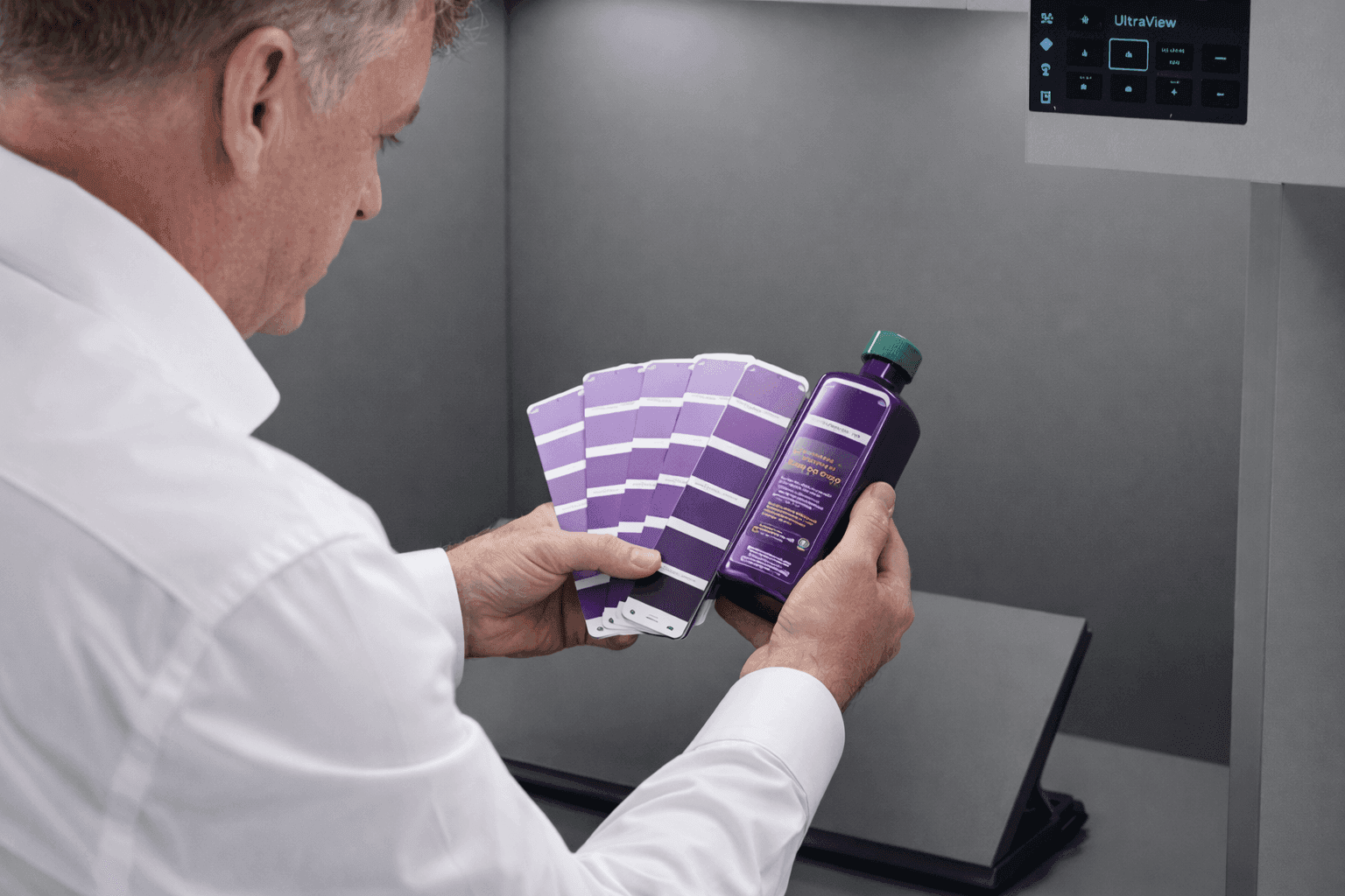
A color professional always works from a reference. The basis for this are:
When master samples are not available, color fans are used, with the awareness that mutual variation is possible. Professional visual assessment therefore means:
Visual assessment is often labeled as subjective. This is only partially true. There are situations where instrumental measurements cannot make sufficient distinction, while the eye does detect a difference. Visual assessment:
If the profession were to ignore visual assessment, an important diagnostic tool would remain unused.
Professional assessment begins with insight into one's own perceptual ability. Various tests exist:
In organizations where the entire team was tested, it regularly turned out:
This demonstrates that testing is crucial for task distribution and quality assurance.
After testing comes development and training. An assessor must be able to:
A color difference can occur in eight directions (light/dark, red/green, yellow/blue, more/less saturation). Without knowledge of this color language, an assessor cannot objectively report what is perceived.
Assessment is never completely isolated. The observer must take into account:
These factors subtly but measurably change perception.
For reliable assessment, a light booth or controlled environment is necessary.
The ability to assess color can be trained and is indispensable for professionals in design, industry, and quality control. Within the courses of the Dutch Color School, this topic is covered extensively and systematically.
👉 Want to learn professional assessment? View the courses at: https://kleurenschool.nl
Questions about visual color assessment or color perception testing? Contact the specialists at the Netherlands Color Institute: https://snki.nl/en/contact
Color perception is context-dependent. Identical color samples can appear different due to background color, light, or spatial configuration. Simultaneous contrast amplifies differences - a gray on red appears greener. Discover how context influences color assessment.
Color influences how we perceive buildings — from apparent size to spatial rhythm. How does this work and what principles underlie it?
Working professionally with color requires more than a good feeling. Discover what knowledge and skills are needed to work systematically and substantiated with color as a color expert in interior, architecture and industry.