Laden...

Laden...
Color harmony plays a major role in how people feel and in how well products sell. Color professionals influence the wellbeing of users, residents and consumers with this on a daily basis. But what exactly is color harmony — and why is it so important?
The theory of color harmony is surprisingly comparable to music theory. Concepts such as tone, timbre, rhythm, cadence, contrast and composition appear in both fields. A color design — whether for interior, exterior, product design or graphic design — can therefore be seen as a composition.
A composition can be:
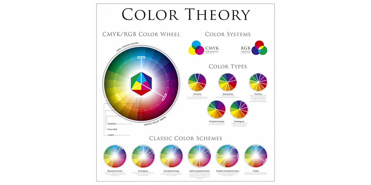
Sometimes color harmony is simplified to "combining complementary colors", but harmony is much broader than that. Complementary colors do give interesting effects within different color mixing systems:
But harmony goes beyond color pairs.
We experience disharmony when:
A classic example: a pink power drill. Pink is culturally associated with softness, playfulness and care. It clashes with the association of strength and robustness we expect from a power drill. Therefore the color feels "not fitting" — and thus disharmonious.
Humans naturally seek balance. When colors are dissonant, unconscious tension or unrest arises. This has direct consequences:
Lightness contrasts also play a role. For the visually impaired, a clear lightness difference between, for example, door and frame is essential. Therefore contrast values are included in building regulations and guidelines for accessible design.
When creating a color advice, you almost always work with multiple colors:
Good advice takes into account:
Do you want to truly understand and apply color harmony at a professional level? Then a solid foundation in perception, color theory and color notation is essential.
In the trainings of the Dutch Color School you will learn:
👉 View the workshop on combining colors at: https://kleurenschool.nl
Questions about color harmony, color combinations or color advice? Contact the specialists at Stichting Nederlands Kleurinstituut: https://snki.nl/en/contact
Apple green is a beautiful color in nature. But on a house? Why color association determines whether we accept a color on a building — and what that says about color policy.
All colors can be combined, but not every combination is functional or pleasant. Why color harmony is not a matter of taste, but of physiology and craftsmanship.
Working professionally with color requires more than a good feeling. Discover what knowledge and skills are needed to work systematically and substantiated with color as a color expert in interior, architecture and industry.