Laden...

Laden...
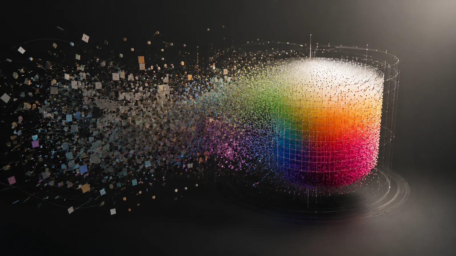
On Wednesday and Thursday, the AIC 2026 Midterm Meeting takes place in Florence — the gathering of the international color association, this year around the theme Colour and Cultural Heritage. I am presenting a system I have worked on for years: the Color Experience System. A good moment to explain what it is and which problem it solves.
There is a curious gap in the profession. Color choice in architecture, healthcare, product design and visual communication still rests predominantly on intuition and style — while decades of validated research exist on how people respond to color. The problem is not a lack of evidence, but the absence of a route: no path runs from an intended experience to a concrete, defensible color choice. Falling back on gut feeling in the absence of such a route is understandable, not a sign of incompetence.
That gap also has a price. At Dutch Design Week, a manufacturer observed that visitors are first attracted by color, but ultimately buy neutral — a striking illustration of the distance between attraction and decision when nothing connects the two.
CES is not a new color theory. It is the missing operational layer between color research and applied color choice: one reproducible decision architecture that translates an intended experience into a bounded, defensible color region in CIE LCh*. It does not compete with color systems such as CIELAB, Munsell or NCS — it sits above them and adds the decision layer they do not provide.
The foundation is broad: over the course of its development, some 6,500 publications were collected and reviewed, of which roughly one hundred core studies carry the concept-color relationships. That makes CES defensible in a way intuition never can be: every recommendation is traceable to its source, so a difference of opinion between two professionals comes down to a named parameter rather than to undocumented taste.
The translation follows a fixed chain: concept → sense → measured basis → cultural shift → bounded color region.
It starts with the experience itself, named as a concept — for example lively or restrained, calm or activating. That concept is anchored in the sense on which it primarily acts, because color works multisensorially: a color can feel warm or smell fresh. Next, a measured basis is determined: the color region that carries that experience, expressed in LCh*. And on top of that comes the cultural layer.
The order is crucial: perception takes precedence over meaning. The direct, bodily color effect that is stable across cultures forms the basis; the learned, symbolic association — which differs per culture — carries less weight and is labeled separately, available for applications where symbolism is precisely the point, such as packaging.
The evidence base aligns with what color-emotion research has long demonstrated: lightness and chroma carry the largest share of the response, hue the least. The warm-cool model achieves an explained variance of R²=0.74, the soft-hard judgment is predicted by lightness with R²=0.87, and across seven regions three factors — carried primarily by chroma and lightness — explain roughly 89% of the variance in color-emotion response.
That last finding is exactly why culture in CES is a shift rather than a separate system: there is a shared underlying structure, and the cultural layer describes in which direction and with what certainty a region deviates from it. CES organizes this via six continental clusters, weighted by the reliability of the underlying source. Where no substantiated shift exists, the basis stands.
That the conference theme is Colour and Cultural Heritage fits well. The cultural layer of CES is beautifully demonstrated through heritage: the historical "old red" of Japanese prints shifted over time toward a measured "new red" around h=17.8°, L*=39.3, C*=64.8. For an Asian heritage context, CES therefore chooses a warm accent color not as a fixed number, but as a base region shifted toward that measured position — measurable, traceable, defensible.
CES is delivered as the Atlas: an interactive working instrument in which you walk the route from concept to color region directly — not a static lookup table. For anyone who works with color professionally and wants their choices to be defensible and reproducible — toward a client, an auditor or a colleague — that is the difference between "this feels right" and "this is the color, and this is why".
If you are in Florence: feel free to drop by the presentation. And if you cannot attend but want to know more about the thinking behind it, the institute is happy to help.
Source: Kotterink, M. (2026). The Color Experience System — A Systematic Framework for Evidence-Based Color Selection (whitepaper v2.0). With, among others, Ou et al. (2004), Valdez & Mehrabian (1994), Gao & Xin (2006), Gao et al. (2007) and Suzuki et al. (2013). Conference: AIC 2026 Midterm Meeting, Florence, September 3–4, 2026.
Red does not mean one thing, and neither does blue. What the two most discussed colors really evoke — universally and culturally — and why 'which red, which blue' determines the meaning.
From gray apartment blocks to neutral interiors – the Netherlands suffers from double chromophobia. Scientific research shows: colorless environments harm well-being, creativity, and social dynamics. Hospitals use color to heal, but where do healthy people live?
Color increases brand recognition up to 80% and determines 90% of first product assessments. Discover how color identity shapes brand personality, which industry-specific color conventions exist, and how to ensure color consistency.