Laden...

Laden...
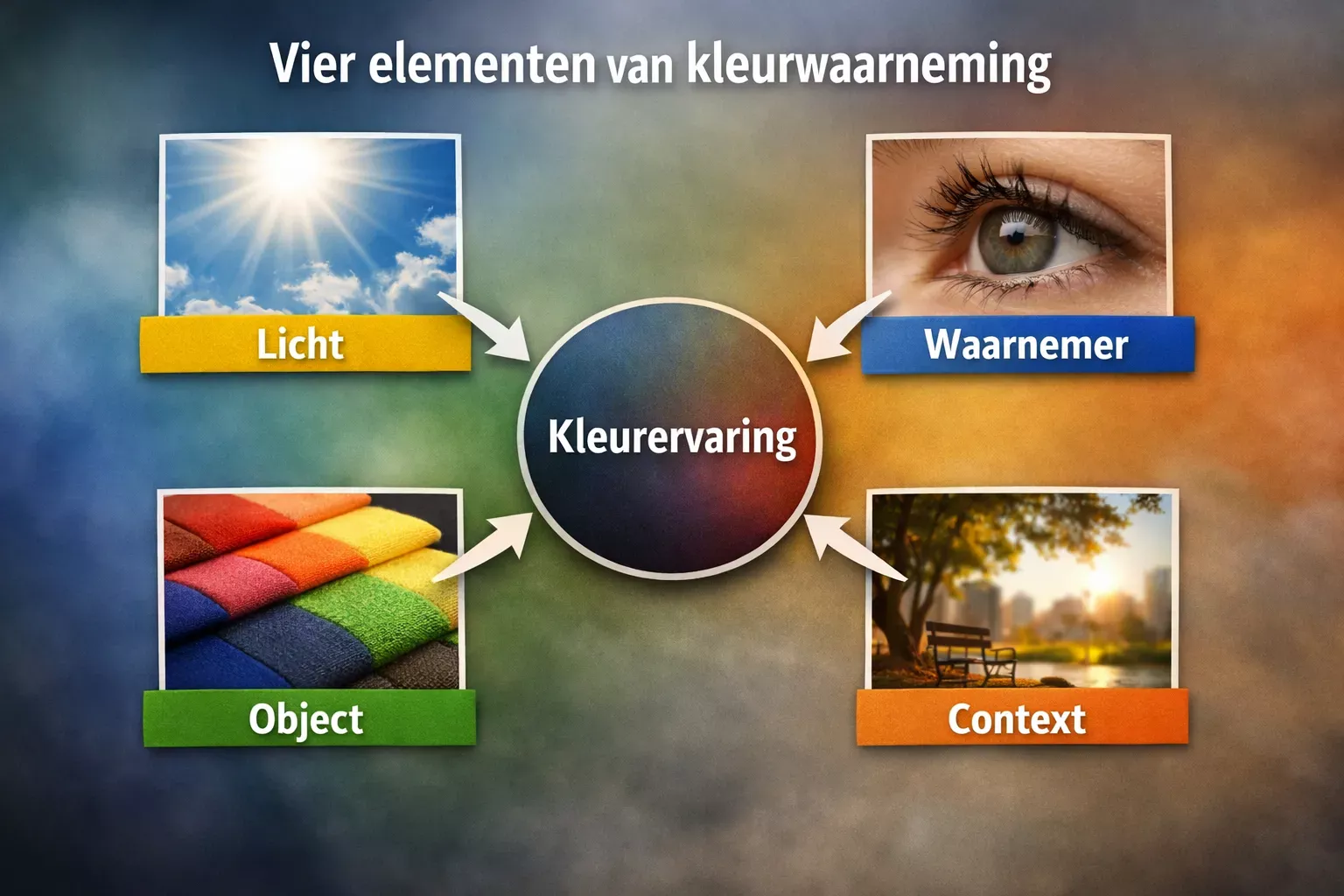
A fundamental insight that forms the basis for every professional color assessment
Imagine: a customer calls with a complaint about color differences in a delivered batch of textile. The measured values fall within tolerance, but the customer still sees a difference visually. How is that possible?
The answer lies in a fundamental insight that many professionals overlook: color is not a property of the product. Color literally does not exist as a physical quantity. It is a perceptual phenomenon that arises from the interplay of four elements. Anyone who understands this solves color problems faster — and prevents them more often.
Color is not a physical property of an object, like mass or dimension. This sounds counterintuitive, but it is the scientific reality. Color arises as the result of the interaction between four fundamental components:
Concretely, this means: when you analyze a color problem, you must always check all four components. A change in just one element can completely alter the overall picture.
A quality manager in the coatings industry who identifies a color difference must systematically verify: is the lighting correct? Has the sample been properly prepared? Who did the assessing? Under which conditions? Only when all four elements have been checked can a reliable judgment be formed.
Light consists of electromagnetic radiation. The visible spectrum — the part our eye can perceive — covers a small range of roughly 380 to 780 nanometers in wavelength.
Each wavelength corresponds to a color sensation:
| Wavelength (nm) | Color |
|---|---|
| 380-450 | Violet |
| 450-485 | Blue |
| 485-500 | Cyan/Blue-green |
| 500-565 | Green |
| 565-590 | Yellow |
| 590-625 | Orange |
| 625-780 | Red |
Important: the boundaries between these colors are not sharp but gradual. And color is not an inherent property of light itself — light merely has a wavelength or combination of wavelengths. Color only arises when our visual system interprets this light.
For professional color assessment, three properties of light sources are decisive:
The SPD describes the relative intensity of radiation at different wavelengths. This is the most fundamental property for color assessment.
There are two main types:
The difference is crucial. A light source with a discontinuous SPD can "hide" certain color nuances because the required wavelengths are simply missing from the emitted spectrum.
The color temperature indicates the apparent color of the light itself:
| Kelvin (K) | Characteristic | Examples |
|---|---|---|
| 2700-3000 | warm, yellowish | incandescent lamps, sunset |
| 3500-4500 | neutral white | standard office lighting |
| 5000-6500 | cool, bluish | daylight, some LEDs |
For professional color assessment, CIE D65 (~6500 K) is used as standard, corresponding to average northern daylight.
The CRI is a measure of how accurately a light source renders colors compared to a reference source. A CRI of 100 means perfect color rendering.
For professional color assessments, a CRI of at least 90 is required. Many office and production spaces have lighting with a considerably lower CRI, which has direct consequences for the reliability of visual color assessments.
When light reaches a material surface, four processes occur — often simultaneously:
The material absorbs light energy and converts it, usually into heat. Selective absorption is the mechanism behind most colors: an object that absorbs blue and green but reflects red appears red. An object that absorbs all visible wavelengths appears black.
Light is bounced back. Two main forms:
The balance between specular and diffuse determines the visual properties: high gloss, silk gloss, satin or matte.
Light passes through the material. Materials range from fully transparent (clear glass) via translucent (frosted glass) to opaque (no light passage).
Light is deflected in different directions by small particles or surface irregularities. This complex phenomenon strongly depends on the ratio between wavelength and the size of the scattering particles.
In practical materials, these four processes occur in combination. A coating on a substrate reflects, absorbs and scatters light simultaneously. A transparent plastic transmits, absorbs and scatters. Understanding these interactions explains why the same pigment looks different in different materials — and why color measurement is always context-dependent.
Use this step-by-step plan when confronted with a color problem:
The fundamental insight that color is not an object property but a perceptual phenomenon changes the way you approach color problems. Instead of searching for a single cause, you systematically analyze all four elements. This leads not only to better problem-solving, but also to more robust quality systems.
References: Kotterink, M. (2025). Kleurbeoordelen in de Praktijk, Deel 1: Theoretische Grondslagen, Chapter 1. Uitg. SNKI. | Nassau, K. (2001). The physics and chemistry of color. Wiley. | CIE (2018). CIE 015:2018 Colorimetry, 4th Edition.
Color is not a property of the object but a perception. Discover the three ingredients — light source, object, observer — and the three knobs hue, lightness and saturation.
Color is not a property of an object, but a perception. Four factors — light source, object, observer and context — together determine what we see. Understand these components and take control of your color assessments.
The human visual system is not a calibrated measuring device. Cone variation, color blindness and age effects mean that no two assessors perceive identically. Understand the biology behind color assessment.