Laden...

Laden...
In 1984, a study appeared that permanently changed thinking about healthcare buildings. Patients recovering from the same operation were compared: one group lay in rooms with a view of trees, the other looked out on a brick wall. The group with a view of greenery recovered faster, needed less pain medication and went home earlier. One difference — the view from the window — had a measurable effect on a medical outcome.
Since then we know: the environment plays a part. Light, view, material and color are not decoration around the care, but active ingredients of it. And yet color in healthcare is still chosen by gut feeling almost everywhere. That is a missed opportunity, because color demonstrably influences perceived stress, orientation, the experience of temperature and the degree of calm or activation in a room.
The most persistent misconception is that there would be one "right" healthcare color — soft green, calm blue, safe beige. It does not exist. What provides security in a delivery room works disorienting in an operating room. What calms a waiting room understimulates a rehabilitation hall. Four questions determine the palette: who uses the room, how long do they stay, in what condition, and which activity takes place there.
A few examples make clear how concrete this becomes.
In the treatment room, the critical factor is not atmosphere but the patient's skin tone. A wall with a green or yellow undertone can distort the skin so much that early signs of jaundice, anemia or a circulation disorder are missed. Neutral, slightly warm tones with a high light reflectance are therefore the norm — and the wall color cannot be separated from the lighting, which must have a high color rendering.
In the operating room, the wall is deliberately blue-green. After looking at red tissue for a long time, the eye projects a complementary afterimage — blue-green — onto nearby surfaces. A blue-green wall absorbs that afterimage instead of making it visible. This is one of the few places where a hue is prescribed on purely medical grounds.
In the waiting room, everything revolves around tension reduction. Muted, medium-saturation blue and green tones increase perceived calm the most — but exactly the same tones in highly saturated form are experienced as restless and clinical. So it is not "blue calms", but which blue.
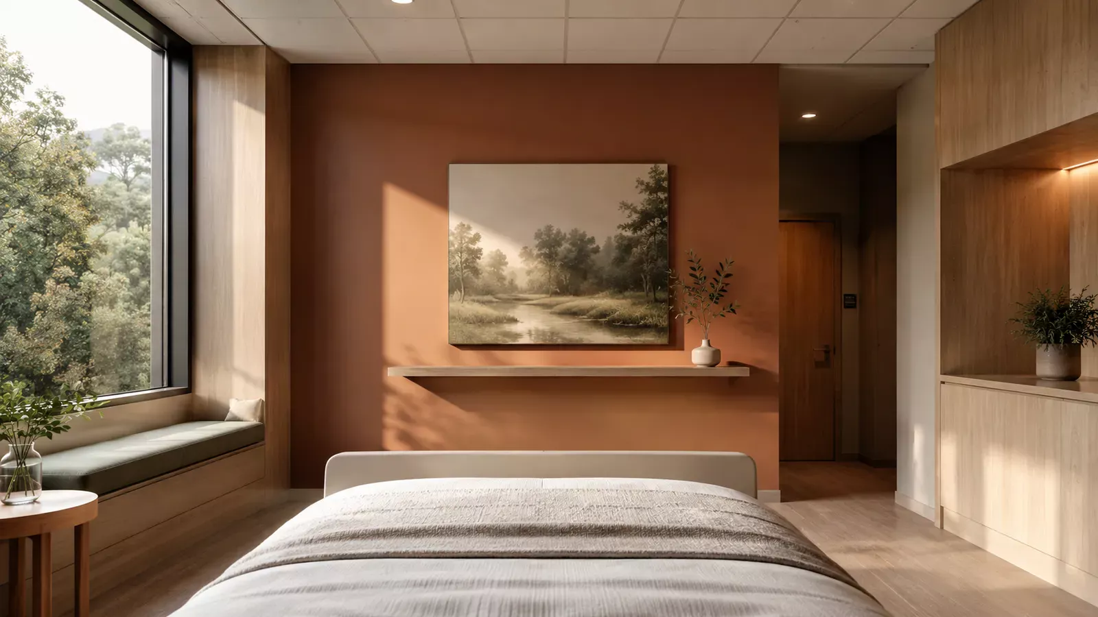
And in the patient room, where the length of stay is longest, the wall the patient faces from bed counts most. A bare white wall offers no recovery stimulus; a busy pattern demands attention in a phase that calls for rest. A warm, lightly differentiated focus wall lowers the experience of stress.
What these examples have in common is the direction in which they are reasoned. An ordinary color system — RAL Design, NCS — starts with the color and fixes it in a code. For healthcare, that order works backwards: you then know which color you have, but not why it would be the right one. The starting point should be the experience the room must evoke — calm, security, activation, recovery — and only then follows the color that delivers it.
Two of the three color properties do most of the work here. Saturation drives the perceived vitality of a room: full, bright tones communicate life and energy, broken grayish tones the opposite. An environment consisting entirely of broken tones — the classic hospital beige — unconsciously steers the experience toward "sick", even before anyone forms a judgment about it. But the reverse, exclusively highly saturated colors, is overwhelming for the vulnerable. The art lies in the ratio, and it differs per room. Lightness drives the primal orientation of light–dark: without a difference in lightness there is no form, no edge, no visibility. Hue, finally, mainly determines the experience of warmth and atmosphere — warm tones feel warm, cool tones cool, regardless of the actual temperature.
By first naming the desired experience and translating it into a range in lightness, saturation and hue, a color choice becomes substantiated and transferable. Not "a calm blue", but "a mid-light, low-saturation blue" — a specification a painter can execute and a client can verify. That is the difference between a color that happens to turn out well and a color of which you know in advance why it works.
Beyond atmosphere, color in healthcare has a hard function: showing people where they are and what they can touch. That is a matter of contrast, not of color choice. Without a difference in lightness — measurable as light reflectance value — there is no form, no edge, no orientation.
For the elderly and people with dementia, that is not comfort but a safety condition. The aging eye admits less light and distinguishes contrasts more poorly, so a higher contrast requirement applies in elderly care than the general standard. A white toilet seat on a white bowl on a white floor is functionally invisible — with fall risk as a result. And one detail is strikingly robust: as dementia progresses, the recognition of red remains intact the longest, while blue, green and yellow are confused earlier. For door handles, grab bars and the toilet door, red is therefore often the safest accent choice.
A final insight that practice often misses: color and lighting cannot be separated. The same wall looks different under cool morning light, warm evening light and dimmed night light. Moreover, the human body has a biological clock driven by light, and a healthcare environment that is lit equally bright and blue day and night disturbs sleep and recovery. Anyone who installs a dynamic lighting system but keeps the walls cool and hard does not get the full effect — the lightness and warmth of the wall must work along with the light.
From this immediately follows the most important working rule: never choose color from loose samples. Every color changes under the influence of the colors and light around it, and on large surfaces colors look more saturated than on a sample. The only reliable test is the room itself, at full size, under the actual lighting.
Treat color in healthcare as a design decision, not a matter of taste. Start with the function of the room and the condition of the user, not with a pretty sample. Guard the contrast where safety and orientation are at stake. Design color and light as one whole. And always test in the actual room before you commit.
If you want to learn to apply this systematically to healthcare projects — from analysis to color concept per room type — the workshop Applied Color Science in Healthcare is designed for that. For a concrete project you can also engage our color consultancy.
Source: Kotterink, M. (2026). Kleur in de Gezondheidszorg — Een praktische gids voor het kiezen van kleuren in de hele sector. Uitgeverij SNKI. With the studies incorporated therein, including Ulrich (1984, view and recovery), Dalke et al. (2004, Lighting and Colour for Hospital Design) and Wijk et al. (1999, color perception in the elderly).
A hospital knows no night — and that harms recovery. Why the day-night rhythm, dynamic lighting and wall color together form one system in the healthcare environment.
The aging eye sees a different room: less light, less contrast, shifted colors. Why color in elderly and dementia care demands stricter contrast requirements and warm tones — and why red is so important.
All colors can be combined, but not every combination is functional or pleasant. Why color harmony is not a matter of taste, but of physiology and craftsmanship.