

The Designer Is Thirty, the Resident Is Eighty — Why Color in Elderly Care Follows Different Rules
The aging eye sees a different room: less light, less contrast, shifted colors. Why color in elderly and dementia care demands stricter contrast requirements and warm tones — and why red is so important.
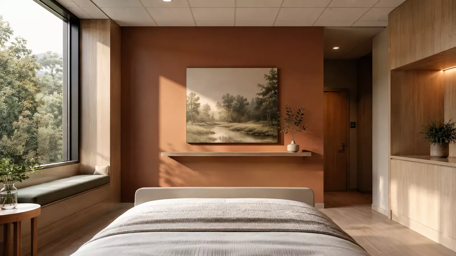
Color in Healthcare Is Not a Matter of Taste — What Science Says About Recovery, Orientation and Safety
Color in healthcare environments is not decoration but a design decision with effects on stress, recovery and safety. What works per room — from waiting room to dementia care.
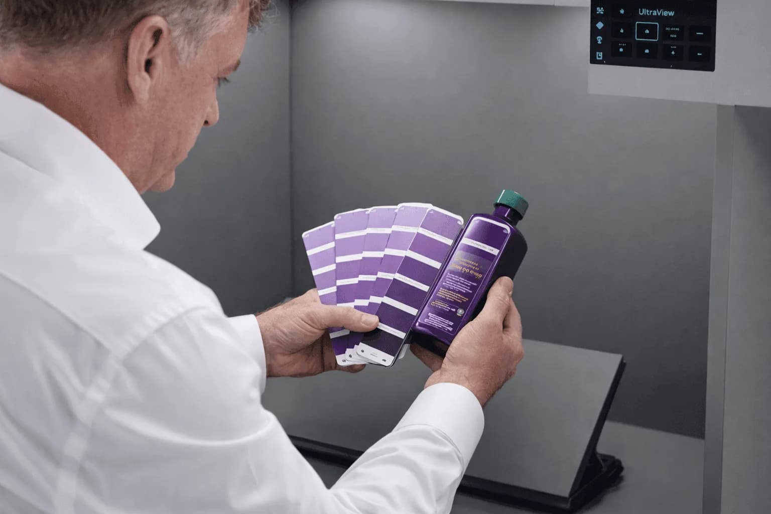
Contextual Color Perception: How Environment Influences Color
Color perception is context-dependent. Identical color samples can appear different due to background color, light, or spatial configuration. Simultaneous contrast amplifies differences - a gray on red appears greener. Discover how context influences color assessment.

Color and Architecture: The Exterior
Color influences how we perceive buildings — from apparent size to spatial rhythm. How does this work and what principles underlie it?
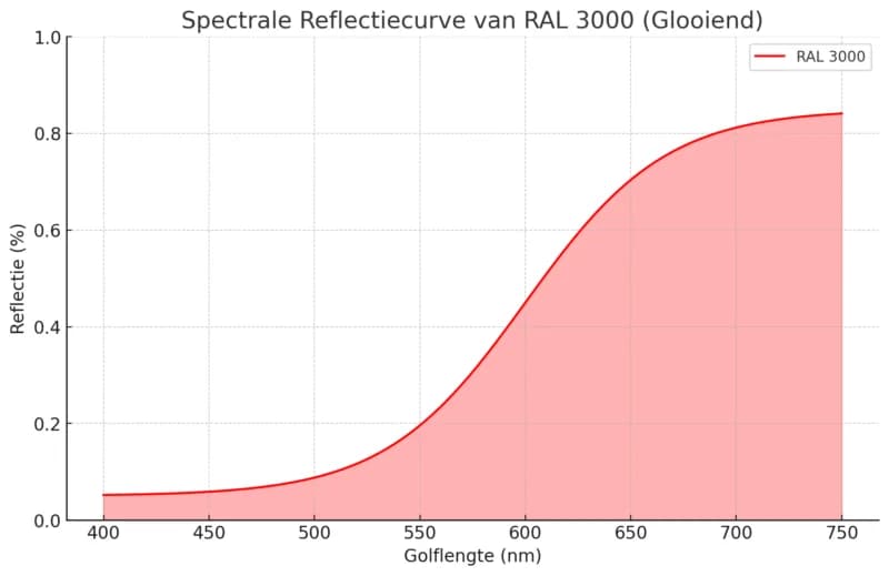
Lightness: The Fundamental Color Parameter for Design
Lightness determines the brightness or darkness of a color and directly influences how a color is experienced. Discover the functional and design-technical aspects of lightness in interior, architecture, and communication.
Can I Trust My Visual Assessment Ability?
The human eye can distinguish millions of color nuances, but is not reliable enough for color-critical assessments without tools. Learn which factors influence visual color perception.