Laden...

Laden...
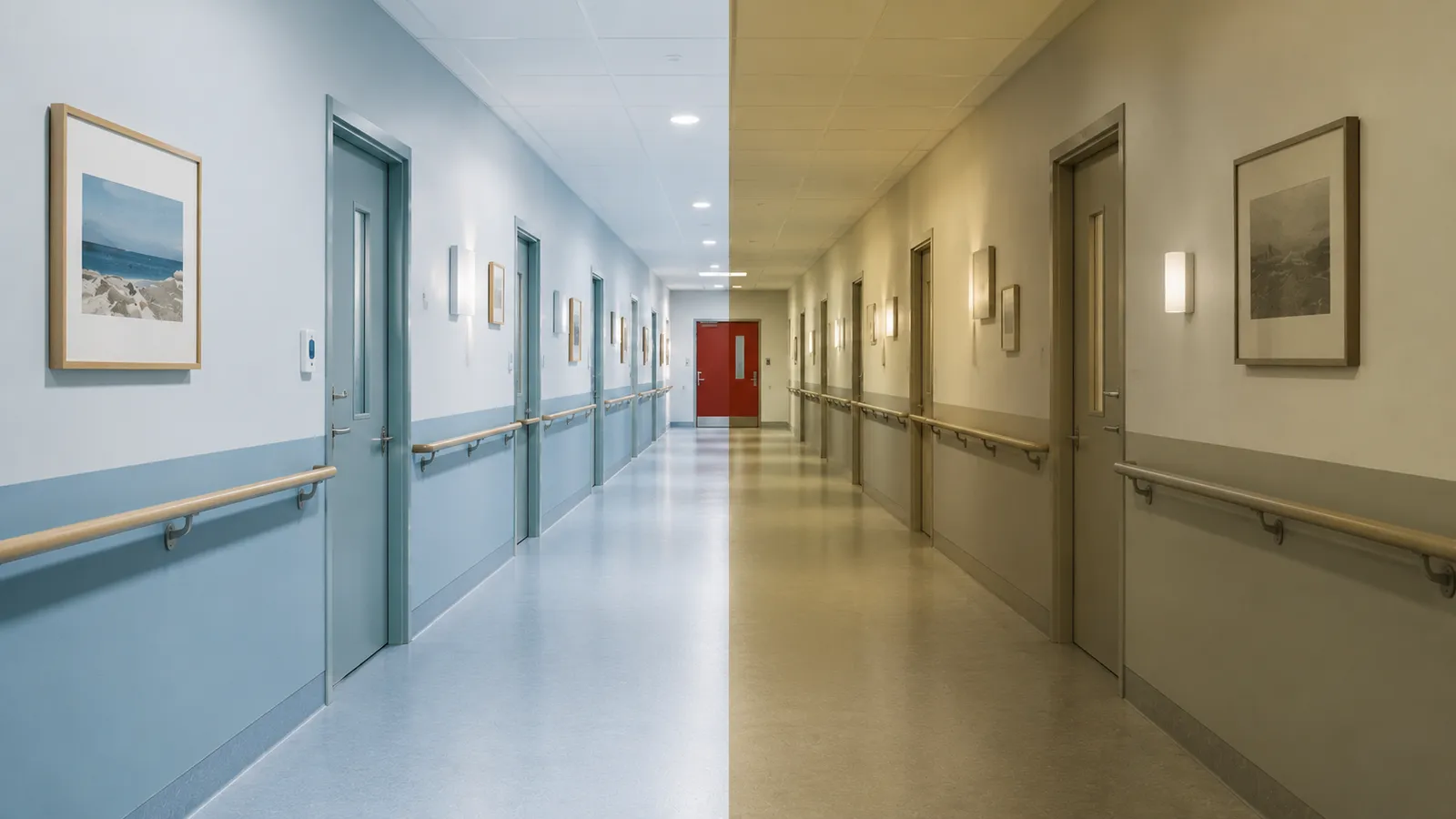
An interior designer chooses colors based on what he himself sees. Usually that is the eye of someone in their thirties or forties. But the eye of an eighty-year-old sees a fundamentally different room — neither lighter nor darker, but different in color, contrast and brightness. Anyone who designs for the elderly without factoring that in designs for the wrong observer. And that is not a detail, but a structural risk.
Around the fortieth year of life, the eye lens begins to yellow. That yellowing absorbs more and more blue and violet light, shifting the image toward yellow and orange. Blue becomes grayish and impure, the distinction between blue and green blurs, and purple looks brownish. At the same time, the pupil becomes smaller: under the same lighting, a seventy-year-old admits two to three times less light than a twenty-year-old. Cataract, present to some degree in most people over 75, scatters the light and lets contrasts fade. The net effect: less light, less color discrimination, less contrast.
Because contrast discrimination declines, a stricter requirement applies in elderly care than the general standard. Where a difference of thirty points in light reflectance value normally suffices between a functional surface and its background, here it is forty to fifty. Door frames, sanitary fixtures, handles and walking routes must stand out clearly. The transition between floor and wall is a critical surface for fall prevention: if that boundary fades, it becomes harder to read the room and place the feet.
Contrast here is not only a matter of safety but also of independence. A walking route marked with a contrasting band on the floor or an accent color on the wall at elbow height naturally draws the resident in the right direction and reduces the effort of navigating. Visibly marked routes encourage residents with dementia to walk on their own and reduce their dependence on staff for getting around — color here becomes a silent signpost that gives the resident back a measure of autonomy.
With age, what is experienced as pleasant also shifts: warm, mid-light, moderately saturated tones. What designers often intend as "calm and neutral" — an environment in white, gray and beige — is experienced by the elderly as monotonous, gloomy and disorienting. An environment without any vitality in its color works against them, precisely for the group that stays in it the longest.
With dementia, another problem is added: distinguishing an object from its background. If an object and its background have too little contrast, the object simply becomes invisible. A white toilet seat on a white bowl on a white floor is functionally impossible to see — with fall risk and incontinence as a result. A door handle in the same color as the door is not recognized as a handle.
One detail is strikingly useful here: as dementia progresses, the recognition of red remains intact the longest, while blue, green and yellow are confused earlier. For a toilet door, a handle or another recognition point, red is therefore often the most robust choice — regardless of the rest of the palette. Research in nursing homes showed that making the toilet door more recognizable directly led to fewer nighttime incidents and more self-reliance.
A final, often underestimated point: gloss. A glossy floor can be seen by someone with dementia as wet or slippery, and a dark glossy floor even as a hole in the ground. These are not irrational fears but real perceptions of a visual system that cannot properly interpret the surface. Matte finishes are therefore the standard, and mirrors call for caution: in advanced dementia, one's own reflection is sometimes not recognized as a reflection.
No single detail illustrates the principle better than the toilet door. A resident with dementia who wants to reach the toilet independently at night must be able to distinguish the door from the surrounding wall — and that is exactly where things often go wrong, because door and wall are executed in the same shade. The solution combines three things: sufficient difference in light reflectance value between door and wall (again the forty-point requirement), a distinctive hue, and where possible red as the recognition color because it remains intact the longest. The effect is not cosmetic: the difference between a door that disappears and a door that is found again is the difference between a nighttime incident and a resident who remains independent.
The same applies to the transition between floor and wall. A skirting board in a tone that clearly contrasts with both the floor and the wall does two things at once: it marks where the floor ends and the wall begins, making the room readable, and it protects the wall against damage. Where that contrast is missing — a light floor against an equally light wall — the boundary fades, and it is exactly that boundary a resident needs to place their feet. What is a subtle color difference for a young eye is, for the user, the difference between walking safely and stumbling.
The preference of the elderly for warm, mid-light tones is not merely a matter of taste; it aligns with how the aging eye works. Because the yellowed lens filters out blue and violet and shifts the image toward yellow-orange, warm tones connect better with what the eye still transmits well, while cool tones can look impure and drab. A warm wall tone therefore looks livelier and friendlier to an older person than the same interior in cool gray, which is quickly experienced as gloomy.
Then there is the saturation. An environment consisting entirely of broken, grayish tones steers the experience toward listlessness — an effect that hits the elderly harder than the young, precisely because they spend most of their day in it. A modest amount of saturation, in the warm direction, gives a room the vitality that chilly neutrality lacks, without descending into busyness. For elderly care, the rule of thumb is therefore not "the more neutral, the calmer", but warm mid-light tones with enough contrast in the places that carry orientation and safety.
Design for the elderly not with your own eye but with that of the user. Increase the contrast where orientation and safety are at stake, choose warm mid-light tones over chilly neutrality, deploy red at the points that must be recognized, and choose matte finishes. These are not aesthetic preferences but functional conditions for dignity and safety.
How to apply this systematically to a concrete healthcare project is covered in the workshop Applied Color Science in Healthcare.
Source: Kotterink, M. (2026). Kleur in de Gezondheidszorg. Uitgeverij SNKI. Including Wijk et al. (1999, color perception in 80-year-olds), Ou et al. (2012, age effects on colour emotion) and research into toilet-door recognizability in dementia care.
A hospital knows no night — and that harms recovery. Why the day-night rhythm, dynamic lighting and wall color together form one system in the healthcare environment.
Color in healthcare environments is not decoration but a design decision with effects on stress, recovery and safety. What works per room — from waiting room to dementia care.
LRV, lightness L*, and spectral values each describe in a different way how a color reflects light. Learn the technical differences between energy reflection, perceptual brightness, and spectral curves using RAL 3000 as an example.