Laden...

Laden...
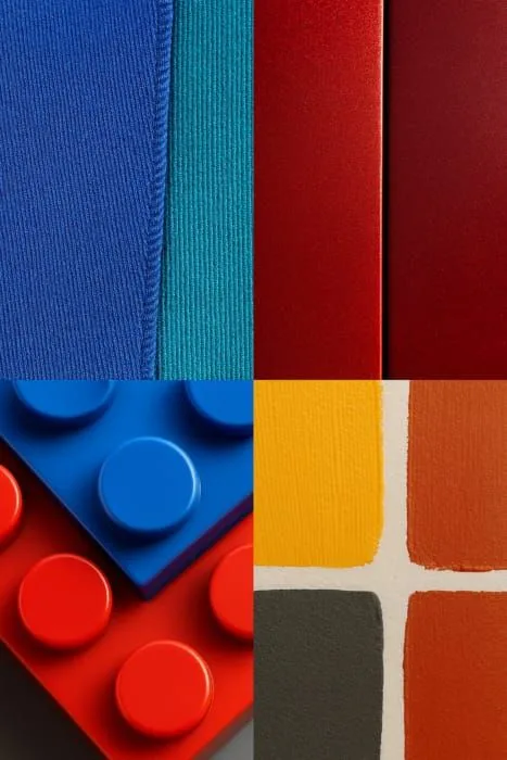
Ontdek onze uitgebreide collectie artikelen over kleur, kleurmeting, kleurpsychologie en kleurapplicaties

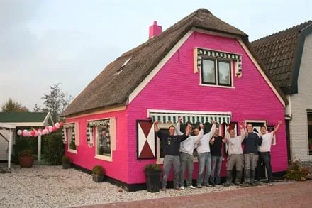
From gray apartment blocks to neutral interiors – the Netherlands suffers from double chromophobia. Scientific research shows: colorless environments harm well-being, creativity, and social dynamics. Hospitals use color to heal, but where do healthy people live?
Het Color Experience System (CES) biedt een systematische, wetenschappelijk onderbouwde methode voor professionele kleurkeuzes. In plaats van te vertrouwen op intuïtie of ervaring alleen, combineert CES gevalideerd onderzoek naar kleurperceptie, psychologie en cultuurverschillen tot een reproduceerbare beslisarchitectuur.
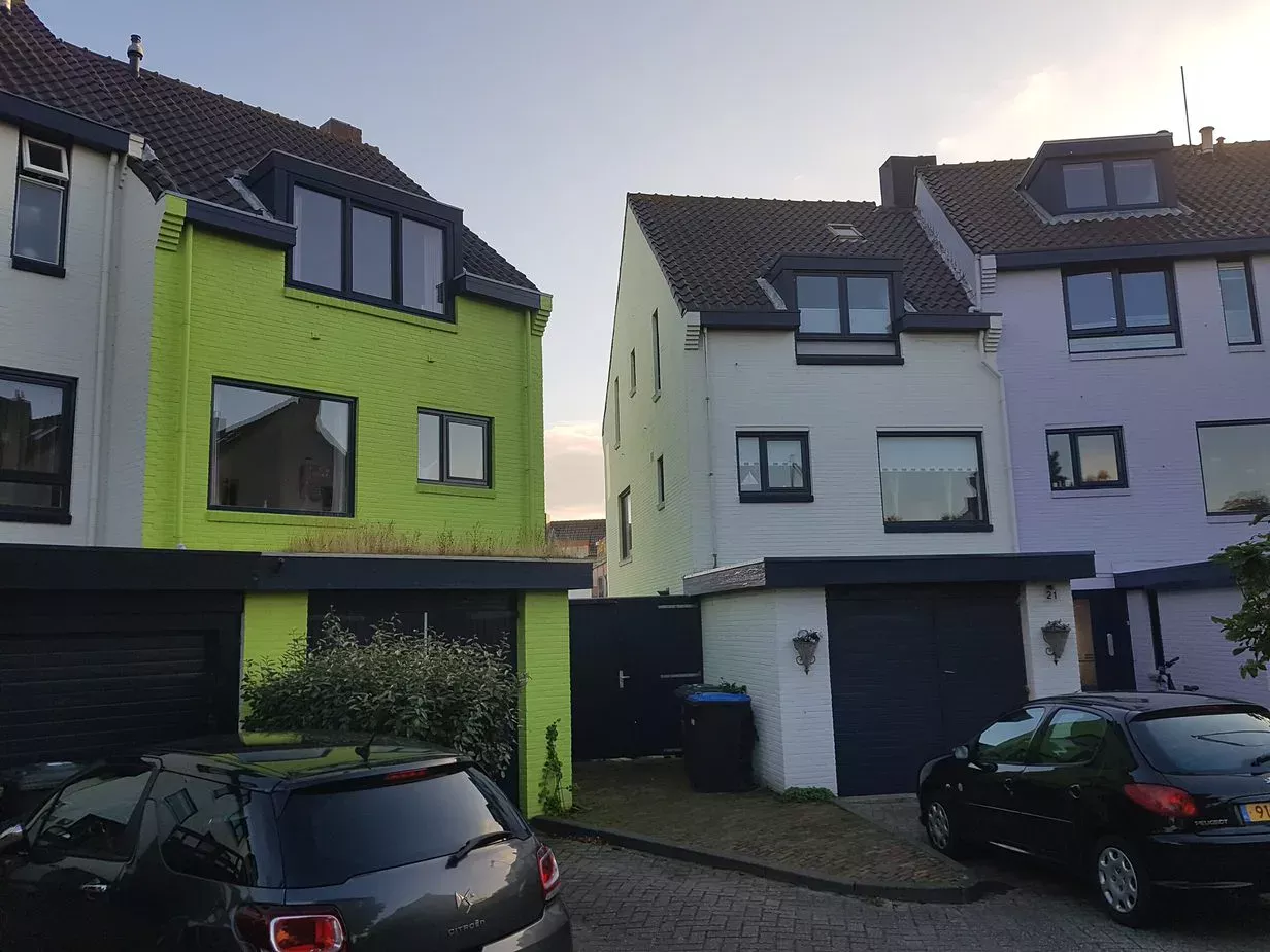
The municipality of Den Helder demands that a bright green house be repainted: the color is allegedly not a pastel color. But what are pastel colors exactly? An analysis using the NCS system.

Consumer behavior is largely determined by color. How color harmony, aesthetics, and color association influence the perception of quality and attractiveness.

How large can a color difference be before a product is rejected? Why tolerances depend on the product, material, and market — and how to establish them.
Apple green is a beautiful color in nature. But on a house? Why color association determines whether we accept a color on a building — and what that says about color policy.

How metamerism causes color deviations under different light sources and which measurement methods can detect it.
All colors can be combined, but not every combination is functional or pleasant. Why color harmony is not a matter of taste, but of physiology and craftsmanship.

In nature, gray, white, and black are associated with decay. Yet we massively choose these colors for our homes and buildings. Are we afraid of color?

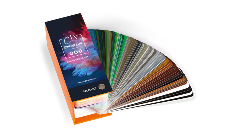
RAL is more than 216 colors. Discover the three RAL collections, from Classic to Design System plus with 1,825 CIELAB-based colors. Everything about coding, differences, and applications.

Color errors cost 2-5% of production costs. Discover the proven ROI of color quality management: from documented payback periods to business cases with 110-790% return.
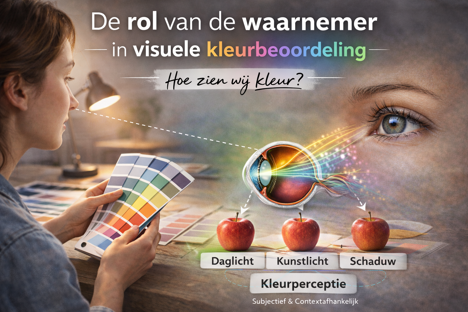
Visual color assessment depends entirely on the observer. Learn everything about color vision testing, individual variations, training requirements, and environmental factors for reliable visual evaluation.

Spectrophotometer validation according to ISO 17025 and ISO 7724: requirements, process, reference standards, and common deviations. Everything about ensuring reliable color measurements.

From individual color knowledge to organization-wide standards: team training as the key to consistent color quality. Including implementation approach, KPIs, and proven ROI up to 800%.

Color perception is context-dependent. Identical color samples can appear different due to background color, light, or spatial configuration. Simultaneous contrast amplifies differences - a gray on red appears greener. Discover how context influences color assessment.

Color deviations arise from variation in material, process, measurement, or specification. 42% is directly linked to process variation. Discover the technical framework for systematic diagnosis with five core steps and RCA methods.
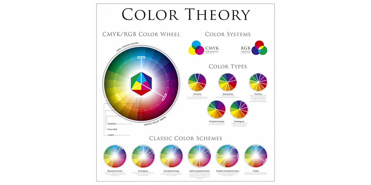
The NCS color image consists of black + white + saturation = 100%. Therefore, the sum of blackness and saturation can never be 100 or more. Here's the explanation.
Each material has unique light interactions that require specific measurement methods. Plastics, metals, and textiles each introduce their own challenges for color assessment. Discover material-specific solutions and protocols.

NCS colors that start with 00 are first edition notations from 1979 — discontinued since 1995. Why they still appear, what the difference is and what to look out for.
Color quality is determined by the interaction between light and material. Discover material-specific color challenges in textiles, plastics, coatings, and digital media, with practical guidelines from industrial applications.

Color increases brand recognition up to 80% and determines 90% of first product assessments. Discover how color identity shapes brand personality, which industry-specific color conventions exist, and how to ensure color consistency.
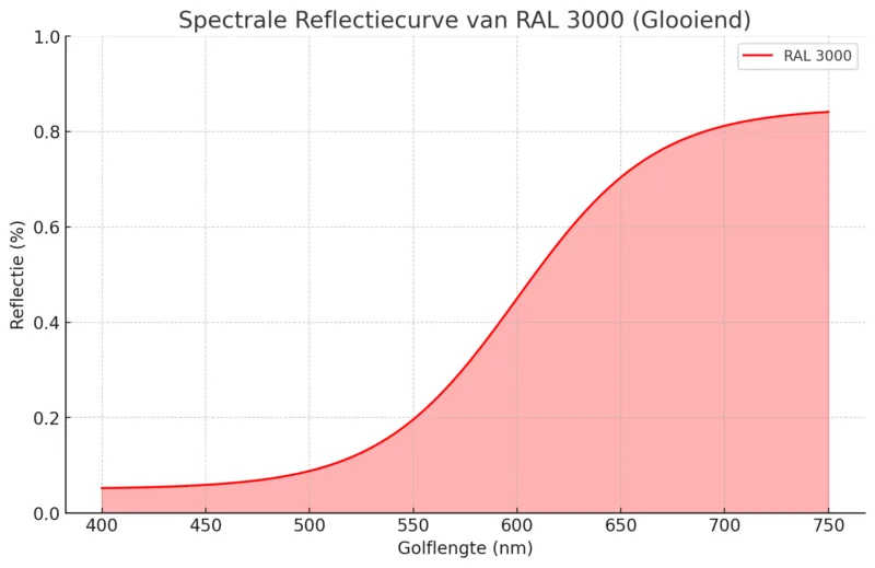
LRV, lightness L*, and spectral values each describe in a different way how a color reflects light. Learn the technical differences between energy reflection, perceptual brightness, and spectral curves using RAL 3000 as an example.
Color difference formulas objectively quantify the difference between two colors. Discover the main formulas - CIE76, CMC, CIE94, and CIEDE2000 - their strengths and when to use which formula.

Color influences how we perceive buildings — from apparent size to spatial rhythm. How does this work and what principles underlie it?
Color preferences are influenced by historical, cultural, psychological, and individual factors. Discover the main principles of color preferences and how they are strategically applied in design and marketing.
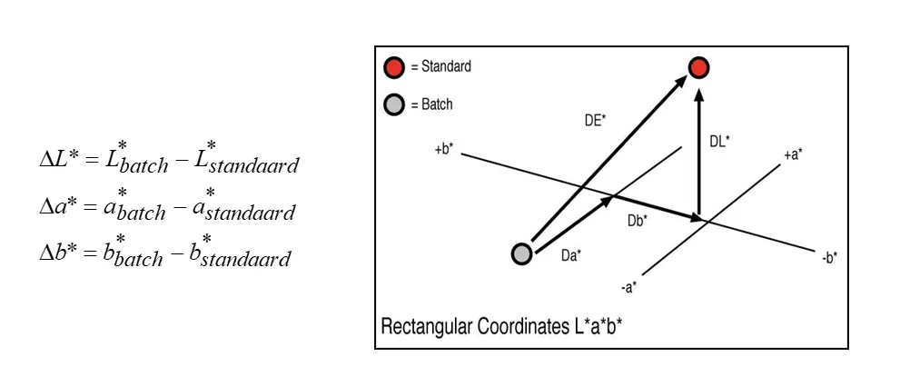
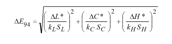
In CIELAB, the difference between two colors is described as the distance between their coordinates. Learn how ΔE*ab is calculated, what ΔL*, Δa*, and Δb* mean, and why modern formulas like ΔE00 are needed.

CIELAB and CIELUV were introduced in 1976 as approximately uniform color spaces. Learn the structure of CIELAB with L*, a*, b*, the conversion from XYZ, and the use of polar coordinates C*ab and hab.
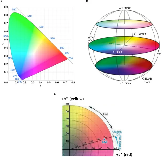
Tristimulus values XYZ are translated in practice to x,y,Y coordinates. However, the x,y diagram is not perceptually uniform, as MacAdam demonstrated with his famous ellipses - an important motivation for CIELAB.
CIELAB is one of the most important systems in colorimetry. Discover the origins of the system, the role of the CIE, and the basis of the XYZ tristimulus values from which CIELAB is derived.

Working professionally with color requires more than a good feeling. Discover what knowledge and skills are needed to work systematically and substantiated with color as a color expert in interior, architecture and industry.
Lightness determines the brightness or darkness of a color and directly influences how a color is experienced. Discover the functional and design-technical aspects of lightness in interior, architecture, and communication.

The measurement environment is just as important as the instrument itself. Temperature, light, vibrations, and contamination directly affect measurement results. Learn how to control environmental factors for reliable color measurements.
Fluorescent colors convert UV radiation into visible light, making them spectacular but also challenging. Learn how to get control of fluorescent colors in measurement, formulation, and quality control.
Small deviations in pigment dosing, equipment, or working methods quickly lead to visible color differences. Learn the 12 essential guidelines to prevent errors in color matching and ensure a reproducible process.
Accurate color measurements do not happen by accident, but through standardized procedures, technical knowledge, and qualified operators. Learn the 13 essential guidelines for consistent and reproducible color measurements.
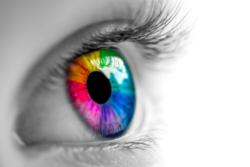
The human eye can distinguish millions of color nuances, but is not reliable enough for color-critical assessments without tools. Learn which factors influence visual color perception.

Color Quality Control and Product Colour Management are often confused, but are fundamentally different. CQC objectively measures what a color is, while PCM manages the entire process of how color is consistently reproduced.
Measuring transparent materials is complex due to light transmission, absorption, and scattering. This article explains how to perform reliable measurements with the right preparation and instrumentation.

Inter-instrument agreement describes the extent to which different instruments produce the same color values. This article explains why this is essential and how to measure it.
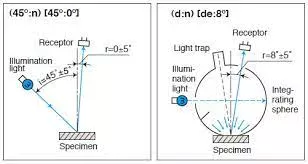
Why don't color measurements match? The cause often lies in confusion between measurement geometry and Standard Observer. This article explains the difference and why both concepts are crucial.
Metamerism is the phenomenon where two colors appear identical under one light source, but visibly differ under another light source. This article explains how metamerism occurs and how to prevent it.
Approximately 80% of consumer choices are influenced by color. This article explains why color is a strategic factor in brand recognition, trust, and purchasing behavior.
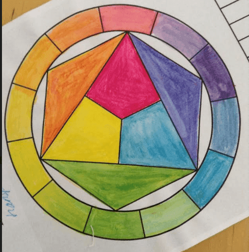
At the AIC color congress, the statement 'Itten is passé' was made. This article explains why Johannes Itten's classical color theory is no longer sufficient for contemporary color professionals.
Color fastness refers to the ability of a material to retain its color under the influence of light, cleaning, and weathering. This article explains what color fastness is and how to test it.

Visual color assessment requires more than just good vision. This article describes the four most important requirements that a professional color assessor must meet.

What do we mean by color quality? This article explains how color quality is defined, measured, and assessed based on nuance, purity, hue, and tolerances.

Knowledge about color is never complete. These are the five most-read blogs of the past year: from color constancy to the impact of color on consumer behavior.

Color directly influences mood and behavior. The context and function of a space determine which colors are appropriate. This article explains how color energy works and why color professionals bear responsibility.
NCS has added 100 new standard colors in the low saturation area. This article explains what these colors mean for professionals in architecture, interior and product design.

Mark Kotterink shares his personal story about craftsmanship, family and the special legacy of his father Maas Kotterink, pioneer in professional color technology and founder of Total Color Technics.

Color continuously changes due to light, distance, and context. This article explains how inherent, perceptual, and identity colors relate and how color perception can be measured.
Color use in interiors influences behavior, perception, orientation, and comfort. This article describes how private versus public, duration of stay, spatial effect, and safety standards determine color choice.
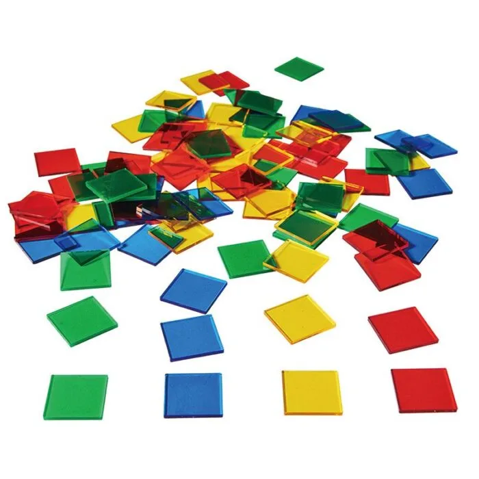
Color harmony affects how people feel and how well products sell. This article explains what color harmony is, when disharmony occurs and why it is so important for professionals.

The word 'tint' has multiple meanings and causes misunderstandings in professional color communication. This article explains why precise terms like hue, saturation and lightness are essential.
Color constancy is the ability to perceive a color as stable under different light sources. This article explains how this mechanism works and why it is essential for professional color assessment.

Those who work professionally with color must master the language of color. This article explains why systematic concepts and color notations are essential for objective color assessment and communication.

Color perception is more than just seeing. Our senses work together when experiencing color. This article explains how touch, smell, hearing, taste, and sight contribute to color assessment.

Material has a direct influence on how color appears. This case study on concrete slabs shows how structure, porosity, and gloss affect color assessment and how tolerances are determined.

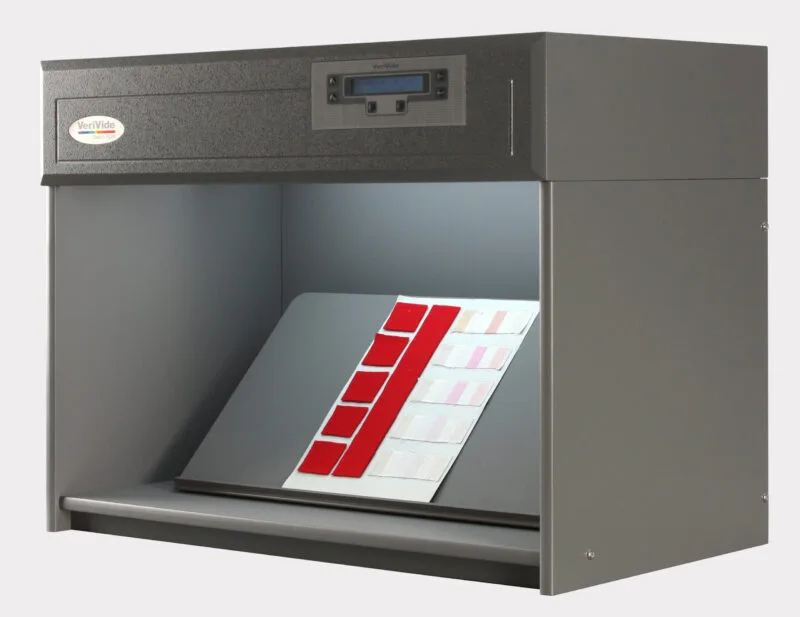
Light determines how color appears. Why metamerism occurs, how light booths work, and why D65 is the standard for professional color assessment.
The color perception ability of the assessor directly determines the reliability of visual color assessment. This article describes why testing and training are essential for color professionals.

Visual color assessment is essential for color specialists. This article describes the five most important factors: perception ability, lighting conditions, material, senses and color notation.

Color perception is directly dependent on the light source. This article explains why two identical facade panels can show visually different colors, despite identical measurements.
Research shows that 80–90% of consumer behavior is determined by color. Color highly influences human behavior, perception, and decision-making processes.
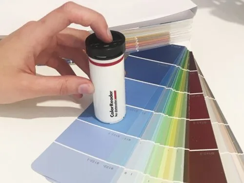
Color readers are accessible and user-friendly, but it's important to understand their capabilities and limitations before you invest.
Sometimes NCS notations appear in books or articles that are technically impossible. The reason lies in the internal mathematical structure of the NCS color space.
Many websites show NCS colors that start with 00. However, these colors don't exist in the current NCS standard. Why not, and what should you know as a color specifier?